Perfecting Pie Charts in R🥧- ggplot Tutorial 11
hive-122108·@algoswithamber·
1.538 HBDPerfecting Pie Charts in R🥧- ggplot Tutorial 11
Do you want to know something funny? The R programming language and the ggplot package are some of the most powerful data visualization software packages on the market, but there is no easy way to create a pie chart in standard ggplot. Rather, we have to create a bar plot and then transform it into a pie chart. This can be incredibly confusing for new users. So in today's post, I'll show you the basics of how to create a pie chart using ggplot.
<iframe width="560" height="315" src="https://www.youtube.com/embed/P-HIaNTBRTg?si=g5HAAH551ONAlf0B" title="YouTube video player" frameborder="0" allow="accelerometer; autoplay; clipboard-write; encrypted-media; gyroscope; picture-in-picture; web-share" referrerpolicy="strict-origin-when-cross-origin" allowfullscreen></iframe>
## Getting Started
As usual, we will start off by opening R studio and pulling the tidyverse package into our library. After we have pulled in the required packages, we will create a sample data frame that contains two columns. We need the column of different categories and the proportion of observations in each category.
```r
install.packages("tidyverse")
library(tidyverse)
df <- data.frame(
category = c("4","6","8"),
prop = c(11,7,14)
)
```
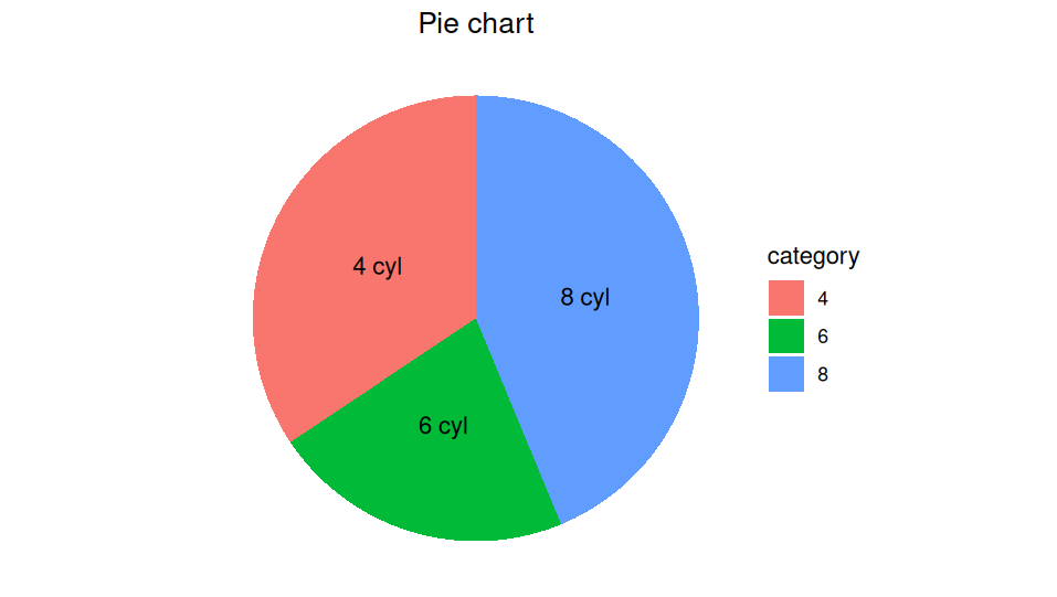
In this example, I am working with the mtcars data set. So the categories in my data frame will be four, six, and eight to represent the number of cylinders that each vehicle has. The second column in my data frame is the proportion column. This represents the counts of each of these different items. For example, there are 11 four-cylinder vehicles, 7 six-cylinder vehicles, and 14 eight-cylinder vehicles.
Once we create the data frame, we also want to create a vector of labels. Keep in mind, it is important for this vector of labels to match the order in your data frame.
```r
label = c("4 cyl","6 cyl","8 cyl")
```
## Making The Plot
Perfect! Now we have all the information we need to make the plot. We're going to start off by creating a bar plot. Yes, I know it sounds crazy to create a bar plot when we actually want a pie chart, but the simple fact of the matter is that ggplot does not have a default pie chart. So we have to create a bar plot and then transform it into a pie chart.
```r
ggplot(data = df, aes ( x= "", y = prop, fill = category))+
geom_bar(stat = "identity", width = 1)+
coord_polar(theta = 'y')+
theme_void()+
labs(title = "Pie chart")+
theme(plot.title = element_text(hjust = .5))+
geom_text(label = label, position = position_stack(vjust = .5))
```
Once you run the code above, it should produce a chart that looks something like this.
## Explaining The Code
As I always say, it can be quite difficult to explain multiple lines of code in an essay format, so I definitely recommend checking out the attached video to understand what each line of this code is doing. However, there are a couple key pieces of information that I want to point out.
- coord_polar is the essential command that flips our bar chart to a pie chart. theta = y sets the angular measurement of our pie chart to the y values that we passed in to the chart.
- theme_void isn't strictly necessary....it just removes a lot of weird labels.
- geom_bar(stat = "identity", width = 1) is important because it tells R to treat the column of y values literally and not perform any calculations. These is another option called stat="count" that we could use if we needed to count the number of each category in the dataset. We don't have to do that here because we already provided the counts in our data frame.
## Summary
Obviously, this isn't the most beautiful pie chart in the world, and it's not going to win any awards for stunning graphic design. However, it is a foundation that we will build from in future tutorials. As always, I appreciate you taking the time to read the article. I hope you found it useful, and I will see you next time!
👍 anthonyadavisii, irivers, gornat, parttimeeconon, lemouth, steemstem-trig, steemstem, dna-replication, roelandp, stemsocial, howo, abigail-dantes, aboutcoolscience, stem.witness, metabs, valth, alexander.alexis, sorin.cristescu, kenadis, sco, intrepidphotos, emiliomoron, alexdory, melvin7, deholt, crowdwitness, curie, techslut, walterjay, dhimmel, oluwatobiloba, helo, tsoldovieri, aidefr, madridbg, geopolis, francostem, gadrian, de-stem, temitayo-pelumi, pboulet, inibless, joeyarnoldvn, nattybongo, noelyss, profwhitetower, enzor, satren, doctor-cog-diss, boxcarblue, empath, steemstorage, dcrops, argo8, steemvault, vcclothing, therising, merit.ahama, marc-allaria, pandasquad, cryptocoinkb, dawnoner, memehub, meritocracy, drricksanchez, newilluminati, metroair, musicvoter2, aries90, lukasbachofner, hetty-rowan, fineartnow, nateaguila, multifacetas, arka1, tfeldman, stayoutoftherz, steveconnor, steemean, baltai, whywhy, modernzorker, captaindingus, arunava, armandosodano, kylealex, psyberx, softa, tokensink, dune69, rt395, rocky1, bil.prag, cakemonster, clpacksperiment, rhemagames, irgendwo, qberry, minerthreat, altleft, mmckinneyphoto13, blingit, investingpennies, sunsea, putu300, artmentor, kevinwong, princessmewmew, bartosz546, photohunt, beta500, coindevil, bscrypto, hairgistix, cryptofiloz, paulmoon410, palasatenea, the100, tawadak24, sunshine, robmolecule, belug, yadamaniart, ohamdache, gunthertopp, neumannsalva, jjerryhan, littlesorceress, callmesmile, bitrocker2020, jayna, meno, the.success.club, delilhavores, talentclub, cloh76, utube, bflanagin, yozen, cliffagreen, quinnertronics, justyy, michelle.gent, adelepazani, takowi, superlotto, failingforwards, pipiczech, felt.buzz, aaronleang, greddyforce, justfavour, jhymi, zipporah, cheese4ead, humbe, driptorchpress, detlev, enjar, gabrielatravels, neneandy, r-nyn, jijisaurart, xeldal, mcsvi, t-nil, bobthebuilder2, tiffin, communitybank, sportscontest, hive-199963, lichtkunstfoto, dr-animation, chipdip, peakecoin, juancar347, oscarina, thelittlebank, coolmole, qwerrie, syh7758520, dgi, peakecoin.bnb, ibt-survival, mproxima, sanderjansenart, primersion, robibasa, holovision.cash, reggaesteem, jerrybanfield, juecoree, uche-nna, hk-curation, wasined, adol, enki, chrislybear, carilinger, buttcoins, aiziqi, nfttunz, robertbira, eric-boucher, bluefinstudios, m1alsan, gamersclassified, teamvn, holovision.stem, tecnotronics,