The Journey through the web of Nightmares Continues
justbecause·@bashadow·
0.000 HBDThe Journey through the web of Nightmares Continues
7-24-2019 <div class="text-justify"> <h2>Learning Progress</h2> <h3>The menu bar</h3> <p>In my previous progress post - <a href="https://steemit.com/justbecause/@bashadow/project-pretty-much-done">Project Pretty Much Done</a> - you can see I have a pretty functional menu. It took some learning to get the dropdown stuff just right. I was also able to figure out and learn the float: "left and right" usage.</p> <p>For this menu I really wanted to be able to learn about centering a drop down menu item. You would think this would be an easy thing, it was anything but. You have to learn about, (find info on), -<b>"transform: translate(-50%, -50%);"</b>----- function. Suffice it to say, it was not an easy undertaking.</p> <h3>The Results So Far</h3> <p>I recommend you read the post on the image, it is much easier to read</p> 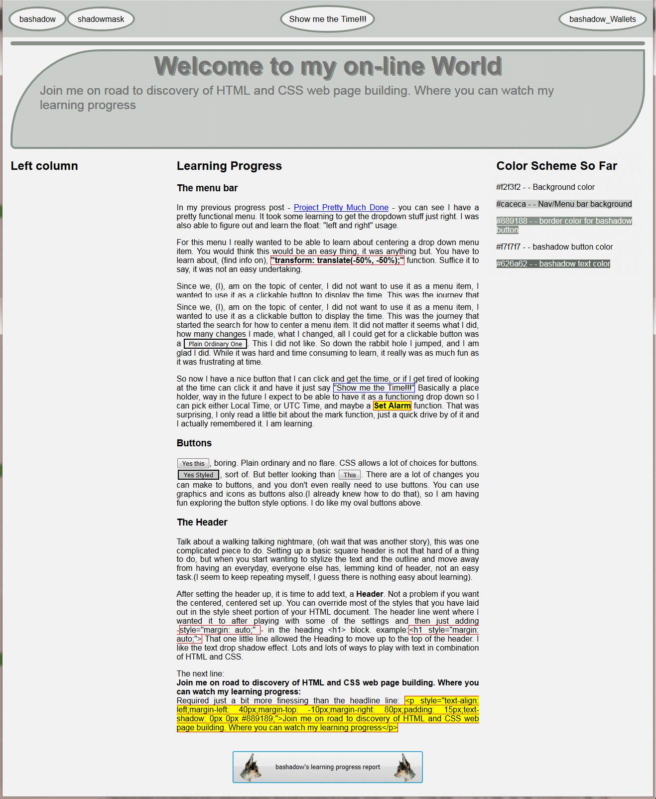 <a href="https://cdn.steemitimages.com/DQmU2txLf5mt5bLVT8WLAph5z6e8GUb4fyEWP8irpqEJaHX">Full View</a> <p>Since I am on the topic of center, I did not want to use it as a menu item, I wanted to use it as a clickable button to display the time. This was the journey that started the search for how to center a menu item. It did not matter it seems what I did, how many changes I made, what I changed, all I could get for a clickable button was a Plain Ordinary One . This I did not like. So down the rabbit hole I jumped, and I am glad I did. While it was hard and time consuming to learn, it really was as much fun as it was frustrating at time.</P> <p>So now I have a nice button that I can click and get the time, or if I get tired of looking at the time can click it and have it just say <b>---"Show me the Time!!!"---</b> Basically a place holder, way in the future I expect to be able to have it as a functioning drop down so I can pick either Local Time, or UTC Time, and maybe a -<b><>Set Alarm</></b> function. That was surprising, I only read a little bit about the mark function, just a quick drive by of it and I actually remembered it. (The mark function lets you highlight text in HTML as you would with a regular highlighter; see the image). I am learning.</p> 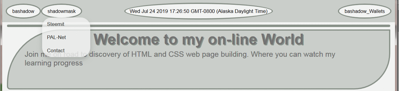 <a href="https://cdn.steemitimages.com/DQmTzTgu3rsai5NiAV6CN97s463mmnQMJA25PjMTHiV8mAc">Full view</a> even though not really needed. You can see the results of clicking the <b>Show me the Time!!!</b> button, you get the time. Also I learned a little bit about the opacity function, and that makes the drop down buttons look a bit nicer in my opinion. <h3> Buttons</h3> `<button>`Yes this <i>(see img)</i>`</button>`, boring. Plain ordinary and no flare. CSS allows a lot of choices for buttons. `<button class="btnplain">`Yes Styled`</button>`<i>(see img)</i>, sort of. But better looking than `<button>`This`</button>`<i>(see img)</i>. There are a lot of changes you can make to buttons, and you don't even really need to use buttons. You can use graphics and icons as buttons also. (I already knew how to do that), so I am having fun exploring the button style options. I do like my oval buttons above.</p> <h3>The Header</h3> <p>Talk about a walking talking nightmare, (oh wait that was another story), this was one complicated piece to do. Setting up a basic square header is not that hard of a thing to do, but when you start wanting to stylize the text and the outline and move away from having an everyday, everyone else has, lemming kind of header, not an easy task. (I seem to keep repeating myself, I guess there is nothing easy about learning).</p> <p>After setting the header up, it is time to add text, a <b>Header</b>. Not a problem if you want the centered, centered set up. You can override most of the styles that you have laid out in the style sheet portion of your HTML document. The header line went where I wanted it to after playing with some of the settings and then just adding <b><h1 style="margin: auto;"></b> in the heading. That one little line allowed the Heading to move up to the top of the header. I like the text drop shadow effect. Lots and lots of ways to play with text in combinations of HTML and CSS.<p> <p>The next line:<br><b>Join me on road to discovery of HTML and CSS web page building. Where you can watch my learning progress:</b><br>Required just a bit more finessing than the headline line: ```<p style="text-align: left;margin-left: 40px;margin-top: -10px;margin-right: 80px;padding: 15px;text-shadow: 0px 0px #889189;">```Join me on road to discovery of HTML and CSS web page building. Where you can watch my learning progress. <h3>Conclusion</h3> It is likely easier to read the above on the image. Mark-up is rather limiting. So I am still around, I am not leaving steemit because of the price, on the contrary I am trying to make it easier on myself to get to where I want to through all the tribes. At last count I have <b><i>NINE</i></b> Tribes to go look through. My start page helps a lot with that. I have been having a lot of fun doing this, now I want to learn a little bit more. Don't get me wrong, I like the look of my page, but I want something with a bit more pizzaz, something that is not just plain ole ordinary. I am getting there. So enough for now. </div>
👍 steiller, elviento, laissez-faire, abh12345, zirochka, map10k, simplymike, gemmaa, elsiekjay, jan23com, choco11oreo11, littleshadow, joseph6232, emaillisahere, buzzbee, caoimhin, upvoteshares, djtrucker, marshalmugi, podg3, misstaken, granddad, daisybuzz, jussbren, suigener1s, gsfgeoff, yeswecan, redrocket, letitgrow, jockkers, jockers, bettyepyn, boohugs, sbi3, minnowbuilder3, kasperr, tcpolymath, thehive, minnowshares, rikue, themesopotamians, marissalingen, davemccoy, edprivat, oac, incinboost, steem-income, teampossible, ilovepoorpeople, winterpeach, unleashpower, nureza, loralgravis, insley, monsterqueen, doza, logantron, nyswine, kymaticus, alldutchcreation, teampeople, cutie-pie, monstergames, itspossible, watchmeschoolu, bestdadever, myronsmashers, iluvwvmountains, cookieicecream, thelogolegend, themanwecanblame, botscravesbds, monsterfightclub, cantescapedeath, monsterbets, travelingstar, dragondestroyer, meangreens, dreadthered, alphaonly, thebadwitch, friendlydragons, monstersndragons, monsterjail, wowthisiscool, anouk.nox, putsauce, umustgambl, eatmyshorts, circles4jerks, poutanes52, kolosfouggi, tuwore, tzukhan, royaleagle, screechypeachy, steemusa, flxlove, wallets4sale, toxicskunky, gawz69, matthewpage, hotmessmama, sumitpo, wirdayulahya, adri3l, comedyopenmic, rahul.stan, idikuci, bitfiend, com-judge, snowyknight, shookriya, homefree, autobodhi, blockmonster, dipoabasch, crystalhuman, pehteem, juxtapozed, creepycreature, belemo, marcovanhassel, robin-mctities, iovoccae, steemlandia, shasta, steem-ua, sargoon, mytechtrail, we-are-steemians, thedarkhorse, we-are, mudcat36, old-guy-photos, fulltimebot74, tattoodjay,