A nice took for making visualization of data as mind maps or flow charts graphics.
mind·@datatreemap·
0.000 HBDA nice took for making visualization of data as mind maps or flow charts graphics.
Today I want to share with my fellow Steemians an online tool which is called [Coggle](https://coggle.it/) With it you can make different data visualizations as for example mind maps or flow charts. Here are some of the visualizations I have done by using this online free tool. Here a visualization of the blockchain technology and all the hype around it from Bitcoin to Ethereum and from Antonopoulos to Vitalik Buterin. 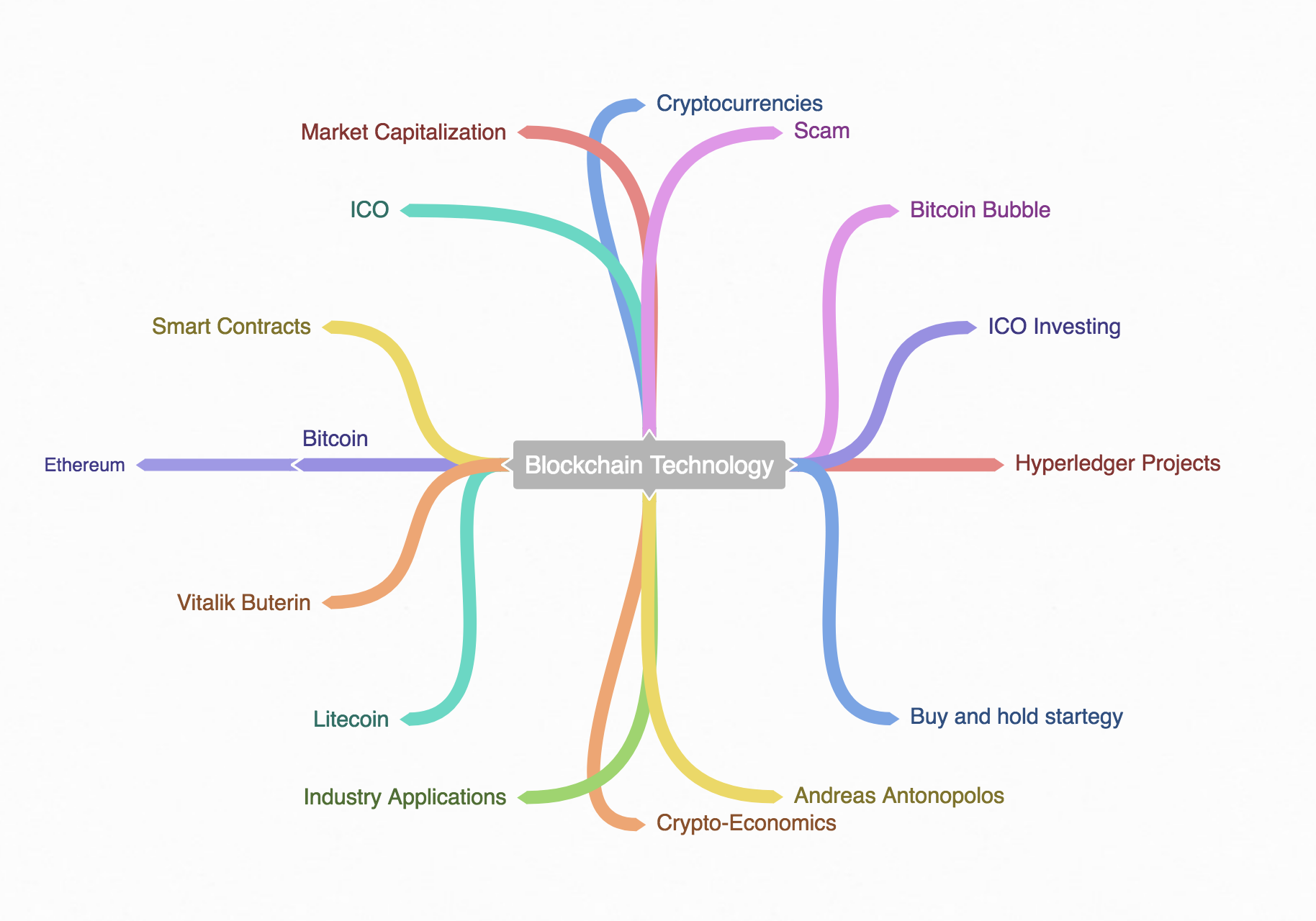 And here a mind map around the SEO (Search Engine Optimization )process. 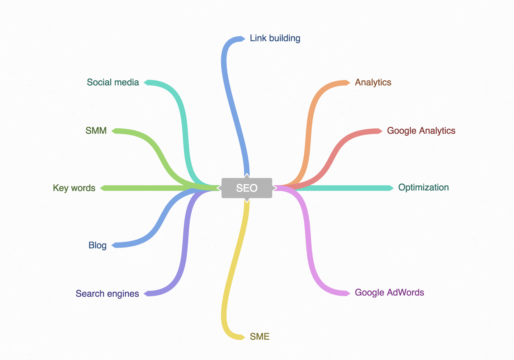 You can also share the link for such mind maps graphics. You can find it here [MindMap about SEO](https://coggle.it/diagram/WkTT-kihWQABHB9N/t/-/162c6e1d23fa924d02a29a738300e342b1b305b862599d08bf33462bad286355) Another interesting type of graphics you can find on Coggle is the following flow chart. 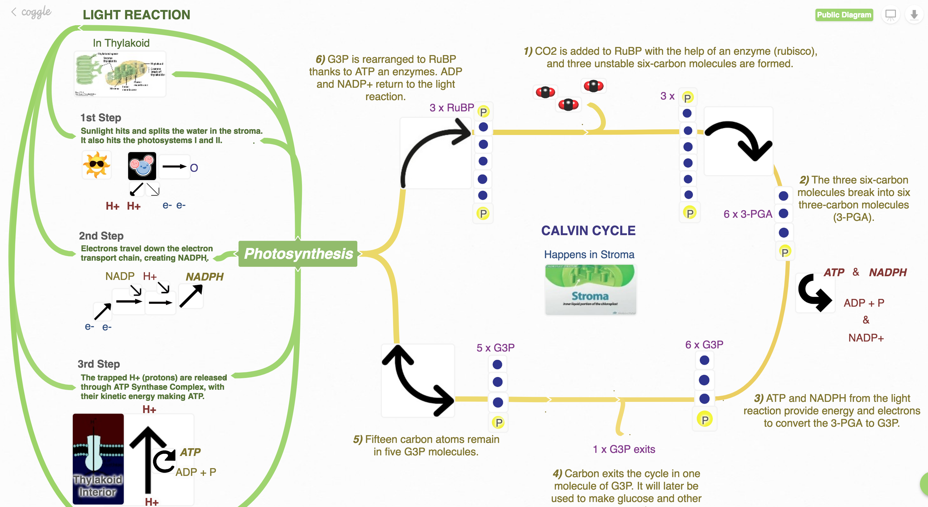 The premium version of Coggle gives you even more features. This is for today! Enjoy :-)
👍 datatreemap, dmiton, hr1, bue, bunny, originalworks2, feriharmansyah, alketcecaj, goldie, nevertolate, datavizcat, mgogel,