Preparing a work for print.
graphics·@davidthelad·
0.000 HBDPreparing a work for print.
Okay so I don’t normally do this, but being a sort of pseudo-designer, and seeing the designs for the Steemit in Nigeria posters, I though to give some advice about how one can prepare an article for print. # So you’re preparing for print  The task of printing or preparing for print, a document is not one to be taken lightly. Sure Many people do not really put to mind the importance of poster creation, but when you consider that thousands of posters are created per day for various event, I say that the job of poster creation and printing is a pretty important job dammit! :<. I have been on and off of graphic designs for at least 2 years, and I was always curious as to how to ready works for print. The type of work I do is simply graphic designs for friends, and even the commercial works I did were all for online works only. A few months back I started to dabble into the world of print and let me just say that it was a whole different world. Despite creating some awesome typography works, or top shot graphical masterpiece, without preparing properly for print, your works will come out as :X ## Bleed! And I don’t mean blood! 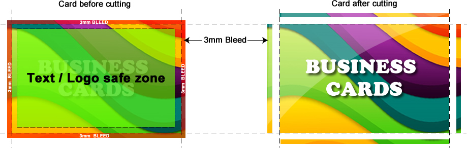 [Image source](https://graphicdesign.stackexchange.com/questions/55905/how-can-i-determine-how-much-bleed-to-use) A printable work without a bleed, is no printable work. A bleed is simply a small extra space around the perimeter of the design, that extends past the graphical work you’re creating. Why Use a bleed? Because a bleed gives you protection in case the printer makes any error in the printing process, which is going to happen a bit when printing a work 10k times. A bleed also makes it easy for a person to trim the outer empty white spaces of a design work, while reducing the chances for error. ## Get your colours right 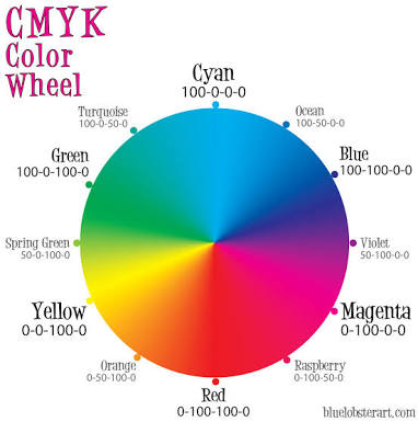.jpg) [Image source](http://dawnsbrain.com/the-cmyk-color-wheel/) Colours, the one thing I got **wrong** all the time was colours. When I first started out, I had no idea what RGB or CMYK was. Well when preparing works for print, the golden rule is to use the CYMK colour mode. CYMK means Cyan, Magenta, Yellow and Key(black). Each colour in your printed out work will be created through a combination of all these four. Please do not use an RGB colour mode. Trust me, your work will end up rather messy. ## Make your text big and pretty 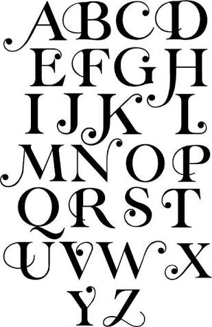.jpg) [Image sourced from here](https://www.google.com.ng/amp/s/www.pinterest.com/amp/explore/typography-alphabet/) This is self explanatory, get your text as large and interesting as possible, and make them legible! Don’t go using comic sans for a business printout, and don’t use sans serif for a comic strip, it looks out of place and so not nice. Although the rules are constantly being broken as they are there to guide rather than be imposed. ## Many other tips I feel should be done include; Knowing the type of paper to use, whether white, brown, heavy, light Knowing the right size to use Designing with margin of error in mind etc Graphic design is a wonderful Job that many can do, its surely a favourite past time for me