Data Visualization In R With plotly
programming·@dkmathstats·
0.000 HBDData Visualization In R With plotly
Hi there. In this post, I showcase some plots in R with the `plotly` package. I have been using this [plotly cheatsheet](https://images.plot.ly/plotly-documentation/images/r_cheat_sheet.pdf) ~~as~~ and [their website for R](https://plot.ly/r/) as references.
Although I use `ggplot2` a lot in R, I think that `plotly` has some good features and the plots look pretty clean for the most part.
<center><img src="https://s3-us-west-1.amazonaws.com/plotly-tutorials/plotly-marketing-pages/images/new-branding/logo/images/plotly-logo-01-stripe%402x.png" /></center>
<center><a href="https://s3-us-west-1.amazonaws.com/plotly-tutorials/plotly-marketing-pages/images/new-branding/logo/images/plotly-logo-01-stripe%402x.png">Featured Image</a></center>
### Plots
---
* Scatterplot
* Line Plot
* Area Plot
* Bar Chart
* Histogram
* Box Plots
* 3D Scatterplot
---
To install `plotly` into R/RStudio use the code `install.packages("plotly")`. After installation, use `library(plotly)` to load in the package into R/RStudio.
The main function for plotting in `plotly` is `plot_ly()`.
**Scatterplot**
Generating a scatterplot is not too difficult. I think adding in labels and a title can be somewhat tricky as it takes time to get through some of the documentation.
```{r}
# Scatter Plot
plot_ly(x = c(2, 3, 5, 8, 10), y = c(1, 0, 4, 2, 8), type = "scatter", mode = 'markers') %>%
layout(xaxis = list(title = "\n x"),
yaxis = list(title = "y \n"),
title = "Simple Scatterplot \n")
```
<center>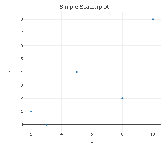</center>
**Line Plot**
A line plot is basically a scatterplot with a line(s) going through the points.
```{r}
# Line Plot:
plot_ly(x = c(2, 3, 5, 8, 10), y = c(1, 0, 4, 2, 8), type = "scatter", mode = "lines") %>%
layout(xaxis = list(title = "\n x"),
yaxis = list(title = "y \n"),
title = "Simple Line Plot \n")
```
<center>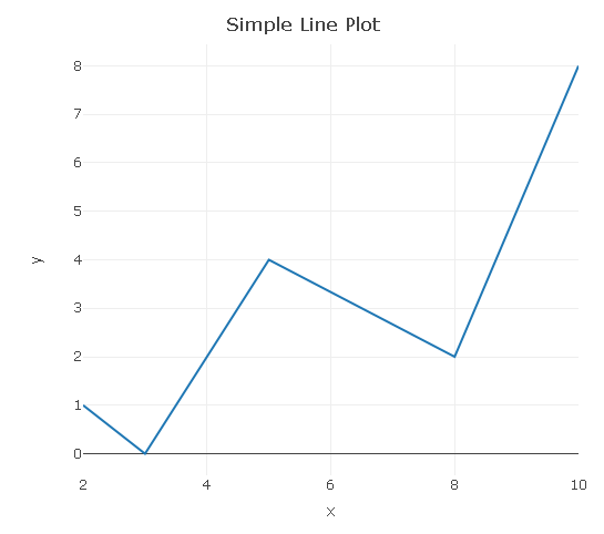</center>
**Area Plot**
A further extension would be adding a filled area under the line (curve).
```{r}
# Area Plot (Area Under A Line/Curve)
plot_ly(x = c(2, 3, 5, 8, 10), y = c(1, 0, 4, 2, 8), type = "scatter", mode = "lines",
fill = 'tozeroy')
```
<center>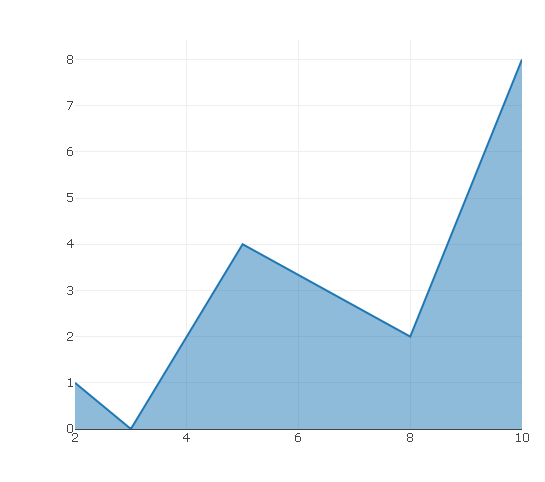</center>
**Bar Graph**
In the `plotly` bar graph, you need to input values for the horizontal axis and the counts in the vertical axis. I have changed the opacity to 0.5 to have the blue bars be lighter.
```{r}
# Bar Chart (Fake Survey):
plot_ly(x = c("Yes", "No"), y = c(54, 60), type = "bar", opacity = 0.5,
marker = list(color = 'rgb(158,202,225)',
line = list(color = 'rgb(8,48,107)', width = 1.5))) %>%
layout(xaxis = list(title = "\n Answer"),
yaxis = list(title = "Counts \n"),
title = "Bar Graph Example \n")
```
<center>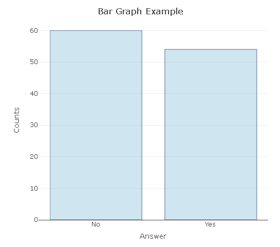</center>
**Histogram**
In this histogram example, I simulate/generate/sample 10000 standard normal random variables and plot the results in a histogram. The resulting histogram approximates the standard normal distribution density (bell shaped curve).
```{r}
# Histogram:
norm_rv <- rnorm(n = 10000, mean = 0, sd = 1)
plot_ly(x = norm_rv, type = "histogram") %>%
layout(xaxis = list(title = "\n Value"),
yaxis = list(title = "Counts \n"),
title = "Histogram Of Simulated Standard Normal Random Variables \n")
```
<center>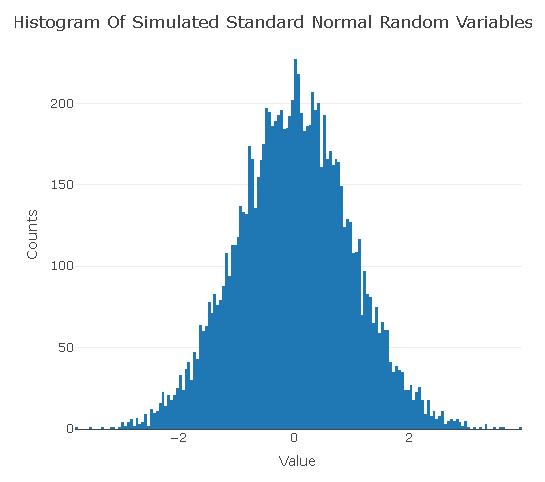</center>
**Box Plots**
```{r}
# Box Plot:
plot_ly(y = rnorm(100), type = "box")
```
<center>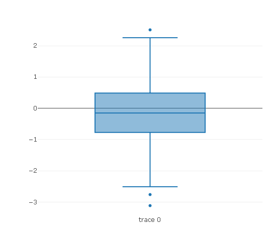</center>
The `add_trace()` function allows for an additional box plot. The second box plot is for chi-squared random variables. (A chi-squared random variable is the square of a normal random variable.)
```{r}
plot_ly(y = rnorm(100), type = "box") %>%
add_trace(y = rchisq(n = 100, df = 1, ncp = 0)) # Two box plots
```
<center>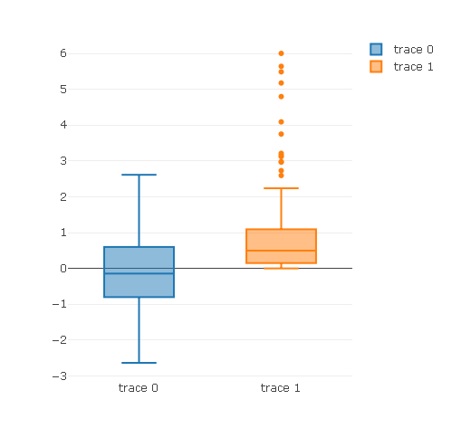
</center>
**3D Scatterplot**
You can create three dimensional scatter plots in `plotly` by having the type as `scatter3d` and having `x`, `y` and `z`. In my computer and RStudio, I found it hard to play with the 3D output. The image below could be better.
```{r}
# 3D Scatter Plot:
plot_ly(x = rnorm(10), y = rnorm(10), z = rnorm(10),
type = "scatter3d",
mode = "markers")
```
<center>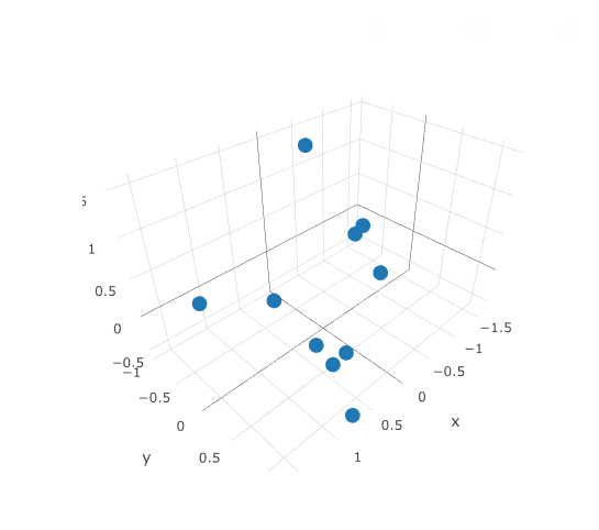</center>
---
Edit: Fixed a few typos.👍 anos, greer184, pilcrow, bitrocker2020, curie, meerkat, dunia, calypso, brahma, anwenbaumeister, hendrikdegrote, nataliejohnson, kushed, pharesim, raykeli89, nrg, steemstem, anarchyhasnogods, the-devil, mobbs, lemouth, kyriacos, lafona-miner, cryptoninja, autodidact88, originalworks, aarkay, ghasemkiani, justtryme90, m2271991, chamviet, stats-n-lats, cristi, fofanos, mckenziegary, space-man, alexander.alexis, ovij, marcusorlyius, masterofcoin, domogo, droida, ronaldsteemit89, cryptotrader2017, alaahasaki, runtime,