Assessing current Bitcoin trends using the Ichimoku Cloud
cryptocurrency·@gargunzola·
0.000 HBDAssessing current Bitcoin trends using the Ichimoku Cloud
Following my [adventures in Bitcoin land](https://steemit.com/cryptocurrency/@gargunzola/adventures-in-bitcoin-land), I considered buying more Bitcoin. Is this a good idea? Well, one way to find out is to look at the chart of Bitcoin's price over the past couple of months and try to predict its future value like an astrologer. ## Should you buy more Bitcoin? I shall attempt to answer this question by using the [Ichimoku Cloud](https://www.investopedia.com/terms/i/ichimoku-cloud.asp). While there is ambiguous [empirical evidence](https://en.wikipedia.org/wiki/Technical_analysis#Empirical_evidence) regarding the efficacy of technical trading, I am currently working my way through the [school of pipsology](https://www.babypips.com). I remain unconvinced that any of the technical trading methods have any [predictive power](https://en.wikipedia.org/wiki/Predictive_power), but I might as well try to apply a few of the things I've learnt in order to deepen my understanding. ## Why the Ichimoku Cloud? The Ichimoku Cloud is designed to provide relevant information at a glance using moving averages that show bullish and bearish crossover points. The cloud parts are meant to indicate the direction of trends. Its full name is [Ichimoku Kinko Hyo](https://en.wikipedia.org/wiki/Ichimoku_Kinkō_Hyō), and it is translated as *one glance equilibrium chart*. Let's have a look at the [current Bitcoin price on Yahoo! Finance](https://finance.yahoo.com/chart/BTC-USD#eyJpbnRlcnZhbCI6ImRheSIsInBlcmlvZGljaXR5IjoxLCJ0aW1lVW5pdCI6bnVsbCwiY2FuZGxlV2lkdGgiOjEwLjI3MjcyNzI3MjcyNzI3Mywidm9sdW1lVW5kZXJsYXkiOnRydWUsImFkaiI6dHJ1ZSwiY3Jvc3NoYWlyIjp0cnVlLCJjaGFydFR5cGUiOiJjYW5kbGUiLCJleHRlbmRlZCI6ZmFsc2UsIm1hcmtldFNlc3Npb25zIjp7fSwiYWdncmVnYXRpb25UeXBlIjoib2hsYyIsImNoYXJ0U2NhbGUiOiJsaW5lYXIiLCJwYW5lbHMiOnsiY2hhcnQiOnsicGVyY2VudCI6MC43NjE5MDQ3NjE5MDQ3NjIsImRpc3BsYXkiOiJCVEMtVVNEIiwiY2hhcnROYW1lIjoiY2hhcnQiLCJ0b3AiOjB9LCLigIxtYWNk4oCMICg1LDMwLDEwKSI6eyJwZXJjZW50IjowLjIzODA5NTIzODA5NTIzODA4LCJkaXNwbGF5Ijoi4oCMbWFjZOKAjCAoNSwzMCwxMCkiLCJjaGFydE5hbWUiOiJjaGFydCIsInRvcCI6MzE3LjcxNDI4NTcxNDI4NTd9fSwic2V0U3BhbiI6bnVsbCwibGluZVdpZHRoIjoyLCJzdHJpcGVkQmFja2dyb3VkIjp0cnVlLCJldmVudHMiOnRydWUsImNvbG9yIjoiIzAwODFmMiIsImN1c3RvbVJhbmdlIjpudWxsLCJzeW1ib2xzIjpbeyJzeW1ib2wiOiJCVEMtVVNEIiwic3ltYm9sT2JqZWN0Ijp7InN5bWJvbCI6IkJUQy1VU0QifSwicGVyaW9kaWNpdHkiOjEsImludGVydmFsIjoiZGF5IiwidGltZVVuaXQiOm51bGwsInNldFNwYW4iOm51bGx9XSwic3R1ZGllcyI6eyJ2b2wgdW5kciI6eyJ0eXBlIjoidm9sIHVuZHIiLCJpbnB1dHMiOnsiaWQiOiJ2b2wgdW5kciIsImRpc3BsYXkiOiJ2b2wgdW5kciJ9LCJvdXRwdXRzIjp7IlVwIFZvbHVtZSI6IiMwMGIwNjEiLCJEb3duIFZvbHVtZSI6IiNGRjMzM0EifSwicGFuZWwiOiJjaGFydCIsInBhcmFtZXRlcnMiOnsiaGVpZ2h0UGVyY2VudGFnZSI6MC4yNSwid2lkdGhGYWN0b3IiOjAuNDUsImNoYXJ0TmFtZSI6ImNoYXJ0In19LCLigIxtYWNk4oCMICg1LDMwLDEwKSI6eyJ0eXBlIjoibWFjZCIsImlucHV0cyI6eyJGYXN0IE1BIFBlcmlvZCI6IjUiLCJTbG93IE1BIFBlcmlvZCI6IjMwIiwiU2lnbmFsIFBlcmlvZCI6IjEwIiwiaWQiOiLigIxtYWNk4oCMICg1LDMwLDEwKSIsImRpc3BsYXkiOiLigIxtYWNk4oCMICg1LDMwLDEwKSJ9LCJvdXRwdXRzIjp7Ik1BQ0QiOiIjYWQ2ZWZmIiwiU2lnbmFsIjoiI2ZmYTMzZiIsIkluY3JlYXNpbmcgQmFyIjoiIzc5ZjRiZCIsIkRlY3JlYXNpbmcgQmFyIjoiI2ZmODA4NCJ9LCJwYW5lbCI6IuKAjG1hY2TigIwgKDUsMzAsMTApIiwicGFyYW1ldGVycyI6eyJjaGFydE5hbWUiOiJjaGFydCJ9fSwi4oCMSWNoaW1va3UgQ2xvdWRz4oCMICg5LDI2LDUyLDI2KSI6eyJ0eXBlIjoiSWNoaW1va3UgQ2xvdWRzIiwiaW5wdXRzIjp7IkNvbnZlcnNpb24gTGluZSBQZXJpb2QiOjksIkJhc2UgTGluZSBQZXJpb2QiOjI2LCJMZWFkaW5nIFNwYW4gQiBQZXJpb2QiOjUyLCJMYWdnaW5nIFNwYW4gUGVyaW9kIjoyNiwiaWQiOiLigIxJY2hpbW9rdSBDbG91ZHPigIwgKDksMjYsNTIsMjYpIiwiZGlzcGxheSI6IuKAjEljaGltb2t1IENsb3Vkc%2BKAjCAoOSwyNiw1MiwyNikifSwib3V0cHV0cyI6eyJDb252ZXJzaW9uIExpbmUiOiIjMDAwMEZGIiwiQmFzZSBMaW5lIjoiI0ZGMDAwMCIsIkxlYWRpbmcgU3BhbiBBIjoiIzAwRkYwMCIsIkxlYWRpbmcgU3BhbiBCIjoiI0ZGMDAwMCIsIkxhZ2dpbmcgU3BhbiI6IiM4MDgwMDAifSwicGFuZWwiOiJjaGFydCIsInBhcmFtZXRlcnMiOnsiY2hhcnROYW1lIjoiY2hhcnQifX19fQ%3D%3D) to get started. 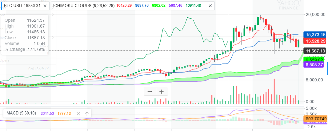 In case you found that as confusing as I did, here is the legend I used to set up the Ichimoku Cloud on the chart: 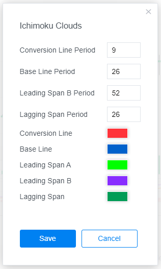 ## What do we see here? I prefer candlestick charts because they show movement at a glance. Around those candlesticks you'll notice a few things: * A red line in the candlesticks. This is called **Tenkan-Sen**, or **Conversion Line** in our legend. * A blue line in the candlesticks. This is called **Kijun-Sen**, or **Base Line** in our legend. * A dark green line behind the candlesticks, to the left. This is called **Chikou**, or **Lagging Span** in our legend. * A light green line below the candlesticks. This is called **Senkou Span A**, or **Leading Span A** in our legend. * A purple line below that green line. This is called **Senkou Span B**, or **Leading Span B** in our legend. * The area between the light green line and the purple line is shaded green. This shaded area is called **Kumo**, or **Cloud**. Note that I've changed the default Yahoo! colours for Tenkan-Sen and Kijun-Sen so they correspond with the Wiki article's description. ## What on earth is going on here? * From the legend, we see that the period for **Conversion Line** is 9 periods. Tenkan-Sen is calculated by adding the highest high and the lowest low for the past 9 periods and dividing it by 2. This is thus the quicker moving average and indicates more recent trends. **The red line shows more recent movements**. * The **Base Line** period is 26 periods. Similarly, Kijun-Sen is calculated by adding the highest high and the lowest low for the past 26 periods and dividing it by 2. This is thus the slower moving average and indicates more long-term trends than Tenkan-Sen. **The blue line shows movements over the longer term**. The idea here is that shorter term movements tend towards longer term movements. Where the red line crosses the blue line, a trend reversal is anticipated. If it was going up, it should be going down. If it was going down, it should be going up. At least, that's the theory, but I remain doubtful. * **Leading Span A** is generated by adding Tenkan-sen and Kijun-sen together and dividing it by 2. Senkou A is the average movement of the average movements. **The green line shows the current trend**. * **Leading Span B** is generated by adding the 52 day high and 52 day low, and dividing the answer by 2. Senkou B is thus the average over a longer period. **The purple line shows the longer trend**. * The **Lagging Line** is the closing price during the past 26 periods. **The dark green line confirms a trend in the clouds**. [Read more about Chikou here](https://www.dailyfx.com/forex/education/trading_tips/daily_trading_lesson/2013/08/08/Definitive_Ichimoku_Guide.html). ## Welcome to the Cloud The clouds are formed between Leading Span A and Leading Span B. The cloud indicates long-term support and resistance. Compare this with the Conversion Line and the Base Line, which indicate more recent, short term trends. They say you should always [start with the cloud](https://www.dailyfx.com/forex/education/trading_tips/daily_trading_lesson/2013/08/08/Definitive_Ichimoku_Guide.html). In our case, green clouds indicate support, while purple clouds indicate resistance. You can read more about the [bullish and bearish signals of the clouds](http://stockcharts.com/school/doku.php?id=chart_school:technical_indicators:ichimoku_cloud) here.  *[Purple Cloud temple](https://en.wikipedia.org/wiki/Purple_Cloud_Temple) in Wudang. Coincidentally, my resistance clouds are purple. They are often red in Ichimoku charts too, I just wanted everything to have its own colour.* ## What does the oracle of the Ichimoku cloud reveal to us? * Starting with the cloud, we see a very clear green cloud. This is a bullish signal and it indicates that things are going onward and upward! But remember that Bitcoin has reached record highs within the past month or so, to this green cloud is hardly informative at this stage. * The red line broke through the blue line a short while ago. Now in theory, this bullish trend should persist until the red and blue lines cross again. * Finally, our confirmation line. Our lagging line is also on the up, showing a recent turnaround. Not surprisingly, the [candlestick pattern](https://en.wikipedia.org/wiki/Candlestick_pattern) also shows a white body - another bullish signal. In conclusion, if this isn't a [dead cat bounce](https://en.wikipedia.org/wiki/Dead_cat_bounce), it may not be a bad idea to buy some Bitcoin right now, or wait until the red line and the blue line kiss again to confirm the turnaround.