Steemit.com Deserves a Homepage Design Worthy of this Great Coin Steem ! We are so close, but the "Devil" is always in the Details ! Please read and support my post, thanks :)
steemit·@gomeravibz·
0.000 HBDSteemit.com Deserves a Homepage Design Worthy of this Great Coin Steem ! We are so close, but the "Devil" is always in the Details ! Please read and support my post, thanks :)
<center></center> So I think we have all seen the new changes in the appearance of the frontend to our Steem Blockchain ! I am surprised to see few posts on this from the community, bar a few which I have read in totality the past few weeks ! Its important first to understand why these changes have been implemented, as indeed I think this was a necessary and wise marketing move on behalf of Steemit.com ! That the marketing and branding of the coin Steem must be completely seperated from that of the social media web site called steemit that uses this coin as its currency of exchange ! There are already a few other sites now also available with tranfers being made also using this great Steem coin as system of exchange ! Busy.org and Zappl.io to name a couple ! So to seperate the logo and branding of this social media web site was a good idea if you ask me and stops the confusion which has been apparent in some circles and troll boxes ) > # So to the meat of this post ! <br> I was long ago, in another life, back before the turn of this millenium in 1999 a fairly successful web-designer in France before the " Dot.com Bubble" took my career away ! Employed by one of the biggest B2B Investment Capital ventures in the world, that was known then as IndustrySuppliers.com. My employers being Cap-Gemini and Advent Partners ! So i can assure you that I do have a good experience in marketing and the creation of visual web communications.So I thought I might take some time to look into the issues that i see myself hearing from others in our community ! I will in this post, show you what i like and dont like about the changes that have been effectuated recently ! I will say that for the best part I think the colour scheme is really quite nice ! I approve totally of the simple use of monochrome colours, the charcoal grey, light grey, and white, which combine together for a nice clean cut and stylistic approach to this page where the written word is our commodity ! I think these colours are perfect because they are indeed the colours you find on any newspaper relaying ,since time in memorial informations to people on their doorstep ! So yeah like it : )) An added bonus being that these "non competetive " colours do make colour images and videos "pop" out from this style of page and with no distracting peripheral interaction being made ! So another cool point for me !! Bravo really !! : ) > ## But for me, and I do say for me !! I think there are some curious button issues that I am seeing, just really minor details which I feel could be and indeed should be remedied ! <br> 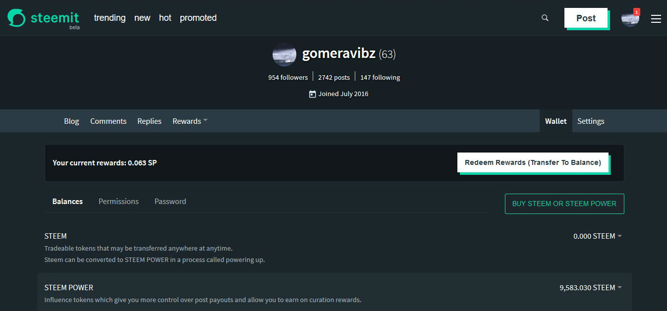 Here is our present frontend set in "WALLET" section of our site ! I have chosen to grab my screenshots with Steemit in " nightmode " as this is certainly very cool for us "late night-red eyed" Steemsters, so thanks for that, much appreciated. This great new option available now in the rolldown menu to the right in your account menu : ) But clearly the changes which I state now are the same in both day and night versions, but the colours being in play are clearly not the same but the principle will be ! I have chosen the wallet page, as it is here that we have the most active buttons and its the buttons which for me have the most issues ! So firstIy, I dont understand why we have different aspects of buttons being shown? As if you look in day mode at our logo it is green and goes black when the mouse rolls over it ! Yet the " POST" button is black and goes green with the mouse rolloever, so the reverse of the Logo ! I personally think the Logo,s colour concerning the web site design looks far better in black hence why have chosen this version of the new logo asd my title image ! So this said, i feel its maybe better that it is black at the opening of the page and becomes green only when the user applies a mouseover ?? So this giving Logo the same charachteristics visually as the " Post" button ! The next thing is this, I think it is important to have a homogenised form for all pages ! Why are there tow very different and conflicting styles being used? Clearly this is all under contruction and this might concievably change. So I do not want to be too crtical of what we are seeing ! Im merely giving my opinon and that really is all . But I must say that I dont care too much for the " blockstyle " button used for the "POST" and "REDEEM REWARDS" button ! As they are, I feel too simplistic and do not have that " cutting edge " style we are trying to get over to the new potential users and investors into Steemit.com ! Whereas the second style of button we see for the "BUY STEEM OR STEEM POWER" in the "WALLET " section is a far nicer approach. I must say that I much prefer this choice of design. As indeed this was the style of button that I was using back in the day in my work on the web site for which I was working ! Even by todays new standards this "vectorial " style of button is a" classic " and is still is for many, the most pleasing and clear cut style design for a button on a web site. Is it not better that we use this style of button through-out the front end ? I hope that you agree with me, as the present disaparity in the form and colour of buttons for me I find unsettling, as it seems confused and not pure ! > # So this is my final remark, it concerns probaly the most important image on Steemit, the "vote" button ! The "vote" button for now is again in this unecessary, 5th visible colour, giving the page again too heavily charged aspect ! I think its possible with just a few minor changes to create a beautiful rendition of the Frontend !But we must hold this nice design and feeling built by the choice of the colours Black, Dark Grey, Light Grey and White values. The fifth colour, green, should only be visible with a mousover on a created link or portal to another location withing the web site ! Here below, are the three visible states of the " vote " button in the "night toggle " mode, to which i refer, they are tiny I know but not having the origional projects i am forced to create these demonstrations from the screen !  first button appearance, no mouseover !  second state with user mouseover but no click !  third state confirmed vote successful ! So here below, is what Steemit.com could look like if these ideas I put forward are taken up ! As I you too can see its not much but these small details, but once rectified, it greatly improve the overall design and feeling I think .Please let me know your thoughts ! 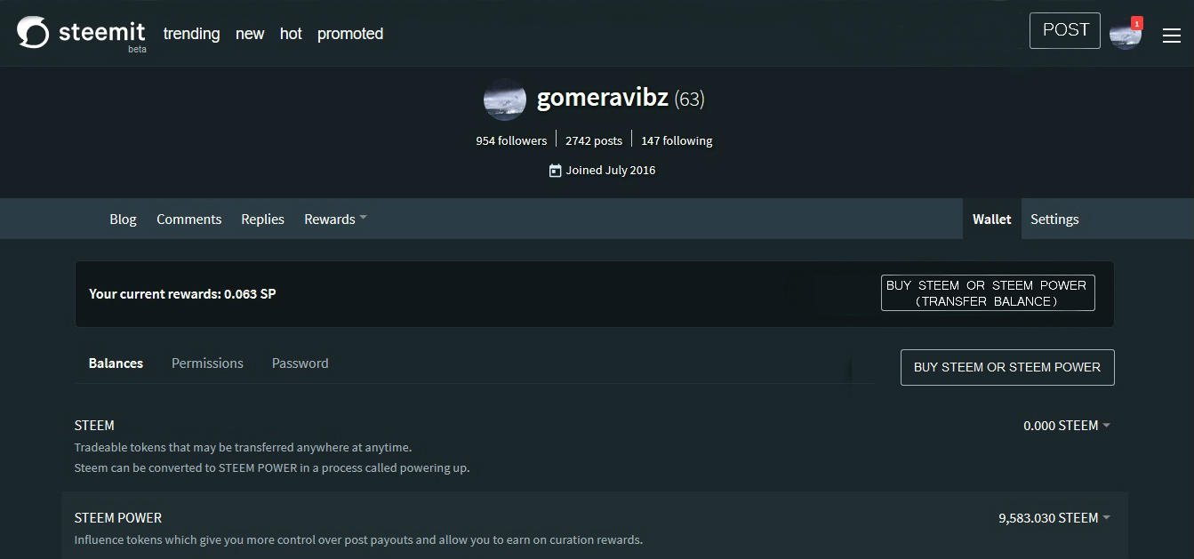 <br> I sincerly hope that the community will take the time to read this post and support my suggestions with their vote and comments ! As I am sure that if taken up and implemented the result will be beneficial to us all, users and investors alikeWe that want to see Steemi and its coin of Blockchain exchange thrive ! > # So All that Said and Done, Steem On Everybody : )
👍 gomeravibz, globocop, minnowsupport, ratticus, bobcoupe, anothervoice, numpypython, whatamidoing, lastminuteman, decibel, ilvacca, onetin84, bekky, barrie, endaksi1, steemprentice, timbalabuch, tradewonk, pusteblume, edrivegom, juvyjabian, raymondspeaks, stephen.king989, jhermanbeans, valth, pomperipossa, starsteem, jhagi.bhai, gindor, beng05, qwasert, taica, natra, cryptohustler, pablito, yoda1917, myday, gamerveda, nesbitt, bluchr, blockchained, yandot, mrliga, battleaxe, zaebars, rusteemitblog, smailer, romancs, burnin, borishaifa, htyfn, socialspace, nadin3, ianboil, boombastic, vl248, sveokla, uuuhha, max-max, mama-steem, victoriart, tatianka, marel, kostaslou, on0tole, marinabogumil, ekaterinka, therajmahal, samether, dmilash, elena-singer, steemlift, anasya, konti, anton333, fbechstein, hyiparena, xanoxt, livingfree, primetimesports, redes, sandra, tremendospercy, aggroed, thatindianlady, garsh, kosyadrreg, selen, galinaberre, andrezddan, jgx358, apoloo1, barcenas, spiry-btc, resteemable, swolesome, jimmyrai28, gktown, tech-trends, alishannoor, teamsteem, berkah, mrs.agsexplorer, pnc, lauralemons, hitmeasap, bitcoiner, lamech-m, siavach, greenstar, turymenecier, amreshchandra, perceptualflaws, yessenia, jasonshick, balinam, sohbet, banka, onedio, bursa, osmanli, bilirmisin, ohadiyorum, mrswhale, hottopic, bitcoinfast, ilginc, englishtchrivy, pharesim,