Visualizing Alt-Coin Correlation
money·@marketstack·
0.000 HBDVisualizing Alt-Coin Correlation
Yesterday I showed you how to [download price data from Binance using Python](https://steemit.com/python/@marketstack/how-to-download-historical-price-data-from-binance-with-python). Today I will show you some of the cool stuff you can do with that data.
In today's tutorial, I want to show you how to download the price data for over 120 crypto pairs which trade on the Binance exchange. We will then look at the correlation between each cyrptocurrency and identify which cyrpto's trade most similarly to STEEM/USDT.
Finding the assets which are most similar to another asset is useful in a number of trading applications, including 1) price prediction, 2) hedging and 3) [statistical arbitrage](https://en.wikipedia.org/wiki/Statistical_arbitrage). We'll talk a little bit more about this in a second, but first, let's take a look at how to download so much data...
We could manually write down the list of symbols... but wait, fuck that!! We're programmers and the best programmers are _lazy_ so let's get the symbols the lazy way using the Binance API:
```python
symbols = json.loads(requests.get("https://api.binance.com/api/v1/exchangeInfo").text)
symbols = [symbol['symbol'] for symbol in symbols['symbols'] if symbol['quoteAsset'] == 'ETH']
```
What we're left with here is a list of any pair with ETH as the quote side of the pair. We will combine this data with the price history of ETH/USDT to create time series for each cryptocurrency quoted in USDT instead of ETH.
To do this we'll use our _get_bars_ function to retrieve the data for ETH/USDT
```python
ethusdt = get_bars('ETHUSDT')
```
We'll use this to create USDT weighted time series for each */ETH pair we have in our list of symbols.
Now let's download historical price data for all the symbols which trade against ETH on Binance:
```python
price_data = []
new_symbols = []
for symbol in symbols:
print(symbol)
data = get_bars(symbol)
new_symbols.append(symbol.replace('ETH','USDT'))
price_data.append(data['c'].astype('float') * ethusdt['c'].astype('float'))
```
For each pair, we've stored the historical price data in a list named _price_data_
Thats not really terribly useful as is, so let's use pandas to merge all the individual pairs into one big dataframe:
```python
combo = pd.concat(price_data, axis = 1)
combo.columns = new_symbols
```
You can see that we've got a shit ton of symbols in there:
```python
combo.div(combo.ix[0]).plot(figsize=(16,9))
```
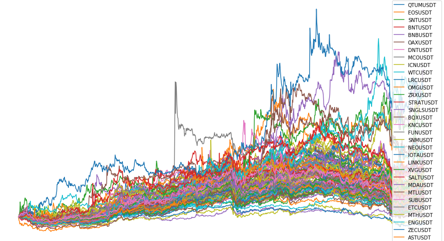
I cut off the legend but it goes on and on and on...
There's _got_ to be a better way to visualize which crypto's flock together... And luckily for us there are much better ways to visualize this!! W00t
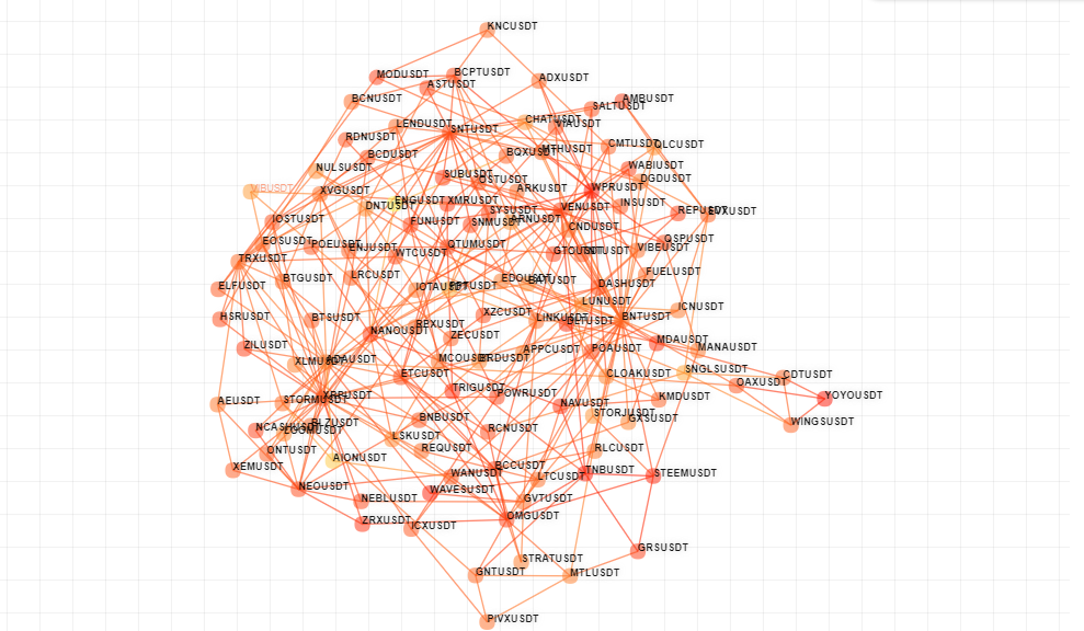
Consider the following graph:
```python
mst = sm.MinimumSpanningTree(dataset = np.log(combo).diff().T)
```
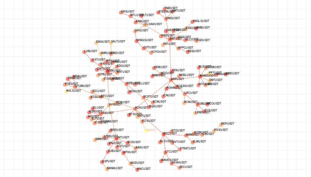
This was created using the same price data that we tried to visualize before. But instead of plotting the raw price data, this graph plots each symbol as a circle or _node_ on a graph. Nodes are connected via _edges_ if their price history is extremely similar.
This type of graph is known as a _Network Graph_ and this particular graph was created using an algorithm known as a _[Minimum Spanning Tree](https://en.wikipedia.org/wiki/Minimum_spanning_tree)_ aka MST
Where is STEEM in this network graph?
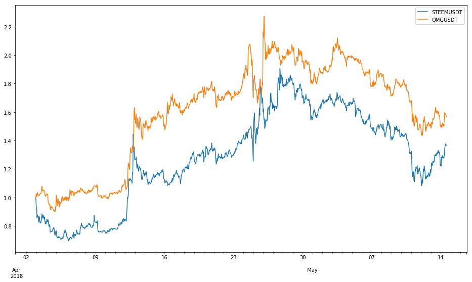
We can see from the graph that the price history of STEEM / USDT is most similar to that of OMG / USDT. You might find that surprising, but a quick look at the side by side prices reveals a striking similarity over time:
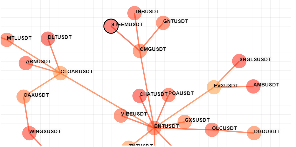
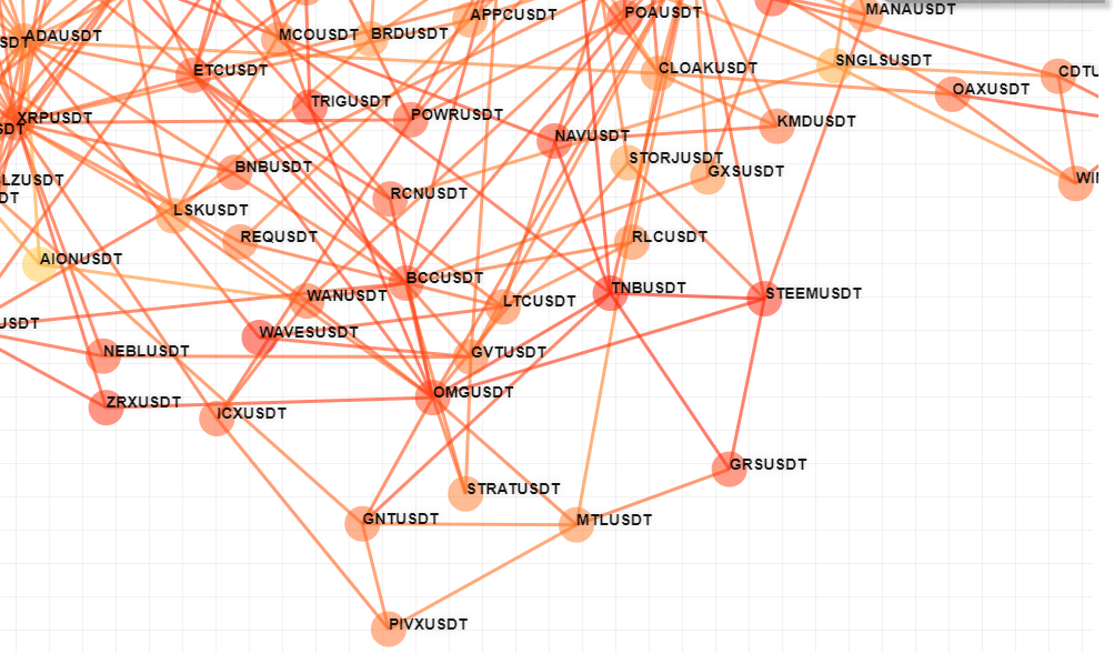
There are other algorithms for creating networks out of correlations. Another algorithm is called the Correlation Filtered Graph. This is the graph which is produced from the same price data using the CFG algorithm.
```python
cfg = sm.CorrelationFilteredGraph(dataset = np.log(combo).diff().T)
```
You can see that the CFG algo generates a lot more edges between nodes. The set of nodes which are directly connected to one particular node is known as the _neighborhood_ of that node.
In the case of STEEM, its neighborhood consists of
```python
cfg.neighborhood("STEEMUSDT")
"""
{'OMGUSDT': {'weight': 0.8315814103529764},
'TNBUSDT': {'weight': 0.8197091679870396},
'STORJUSDT': {'weight': 0.7506614670521796},
'GRSUSDT': {'weight': 0.5237622731586296},
'MANAUSDT': {'weight': 0.7429232474210377},
'BNTUSDT': {'weight': 0.8303019286045419}}
"'"
```
We can plot the neighborhood of STEEM to verify the similarities of each price history:
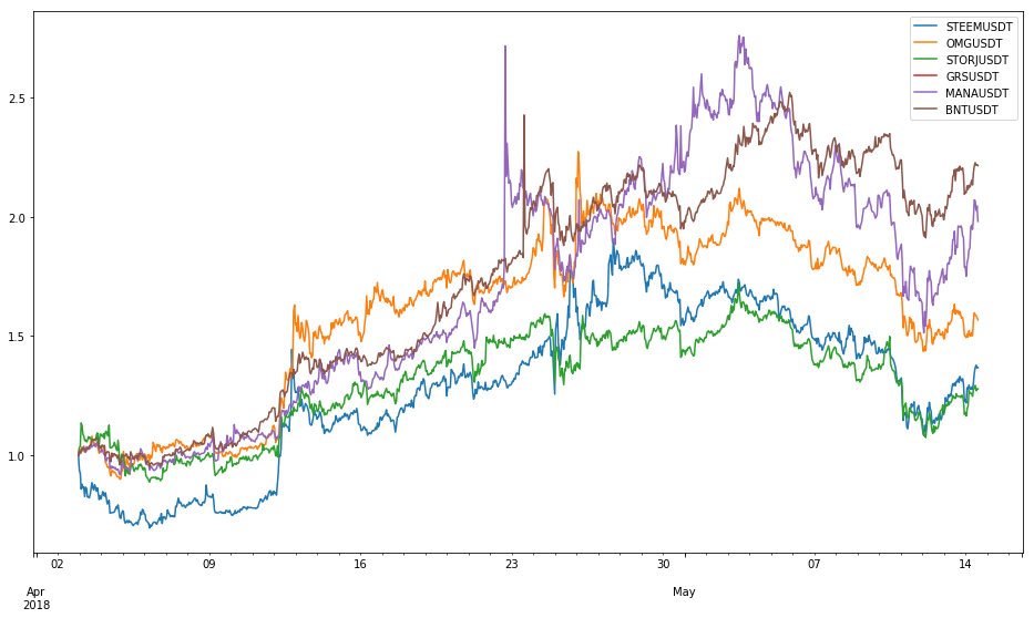
This would suggest there exists a pretty good portfolio rebalancing trade between all of these crypto's, at least thats been the case over the time frame we looked at (the last month). Correlations are not constant in financial markets and cryptocurrencies are no exception to the rule. Thus it is important to update your model's internal correlation as market conditions evolve. However, this is a trivial process using our _get_bars_ function combined with the script above. All one would have to do is download new data everyday and then you could update your trading models.
Another thing thats interesting about STEEM is that, in both graphs, it is positioned near the edge or _periphery_ of the graph. Nodes which are near the periphery are some of the most unique nodes in the dataset, as nodes which are very similar to many other nodes tend to cluster towards the _center_ of the graph.
The bad news is that STEEM appears to be one of the worst performing in its cluster over the last month.
Another way to look at _portfolio diversification_ is really just maximizing the average distance between the nodes in your portfolio. If you have a portfolio which is clustered in the same part of the graph then you basically have multiple statistical copies of the same asset... When one goes down they all go down and visa versa. This is the opposite of diversification.
On the other hand, assembling a portfolio of symbols which are truly different from one another means when one crypto is down, its likely that another part of your portfolio is up, thus providing the _hedging effect_ which is the foundation of successful diversification.
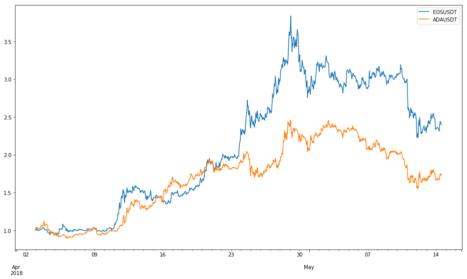
So where's EOS in all this madness?
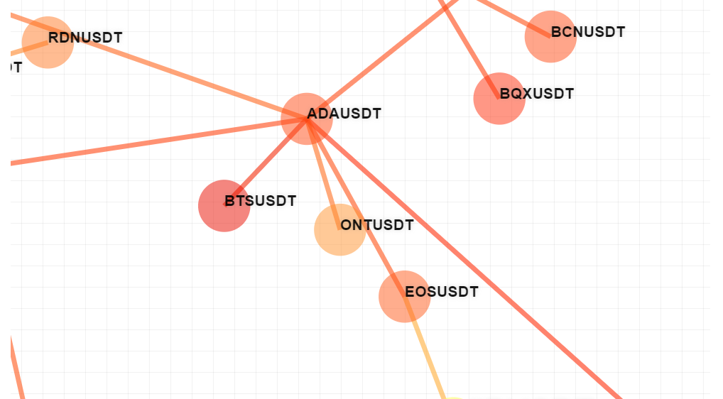
Right next to Cardano, apparently!
If you're interested in creating these graphs yourself, please let me know. These particular network graphs we're created using proprietary software which requires an API key to use.
<hr>
<center>
https://steemitimages.com/DQmNThMVyakaybJ58chbgNQPXdL8neSuYs358KfrW1vNN3X/image.png
<h3>Follow @marketstack for more updates about trading, finance, and technology</h3>
</center>👍 osama-rodriguez4, marketstack, sinarbarona, lionindayard, adilvakhri, propane, claudiop63, fbslo, adeyemidrey, tinyhomeliving, naijatimez, cryptos, barmbo, kirstin, l01, steemseph, ayoade96, dancingdragon, eduards, risingwedge, scubacoin, nealmcspadden, esteemboard, dzone, magictoni, foremostwiseguy, sheilamenher, martaedyta, ura-soul, koldrr27, yateszey, riery, gnarlyanimations, altcoingamer, minnowbooster, acdevan, indigoocean, nowonline, rushcash, midraruddin, transisto, fregonzalez, hilarski, hiddenid, calvin87, originalathena, likvidator, alan369, nameui, gamiee, jesusaddict, senseicat, mad-karma, sagtany, rofilm, hbaskan, akhi003, renoscoin, lud, alexsund, south-man, amitrawat, zocker1347, jonasbayer, gasigogi, steem-bar, hashas120, ronni, mybestnews, camillesteemer, trollshunter, a-steemdefleague, cryptocengineer, yachtdesigner, lulita, thetradercafe, a-cmsidl, jaybirds, altumanimo, war-tp, pavlichenko, phuzion7, coleenmiler, isaiasprais, ashokachandani, dregnar92, cryptofy, chaunguyen1997, dyan8, rtytf, hyunwungjae, crazecrypt, juancontinental, shivaa, rizalfajri, kugaren, ntony, coinfarmer165, twanz, gambetti, cryptoplebs, euggud, tomkim1981, svagoweb, iklil46, pierlave, samue2013, wisco7, modhumita16, parislite, beyondlock, munawardi, lovethenature, duranzo89, rohit12123, ouma-izi, teevmoore, lorenzor, krypciak, mlgcrypto, koreaminer, whatwelivefor, marksasaki, muna01, giokaceh, jang, connorsmith, roostermine, jamiliafidan, losk, binam, muhamadin, kkoepke, icarst31,