Exploring Components in Bootstrap 4.1
utopian-io·@steveblucher·
0.000 HBDExploring Components in Bootstrap 4.1
#### Repository
https://github.com/twbs/bootstrap
#### What Will I Learn?
If you read this tutorial, you will explore the following learning objectives:
- What is Twitter Bootstrap?
- How does Bootstrap work?
- How to include Bootstrap in your HTML files.
- How to use some of the more useful components in the Bootstrap library.
- How to write some custom CSS to override Bootstrap settings.
#### Requirements
To follow this tutorial, you will require a computer (laptop or desktop) with the following:
- A basic understanding of HTML and CSS (mainly how to create a file and link it to the browser).
- A text editor installed ([Atom](https://atom.io/), or [Visual Studio Code](https://code.visualstudio.com/) are my preferred).
- Access to a Web Browser (Chrome, Safari, Firefox or Opera).
- Access to your Command Line Interface (CLI).
- An internet connection.
- The following websites: [Bootstrap](https://getbootstrap.com/), [Font Awesome](https://fontawesome.com/), [GitHub](https://github.com/FortAwesome/Font-Awesome).
- Some images for use with the components.
#### Difficulty
- Basic
---
#### Tutorial Contents
Well, lets get under way, shall we?
<center>
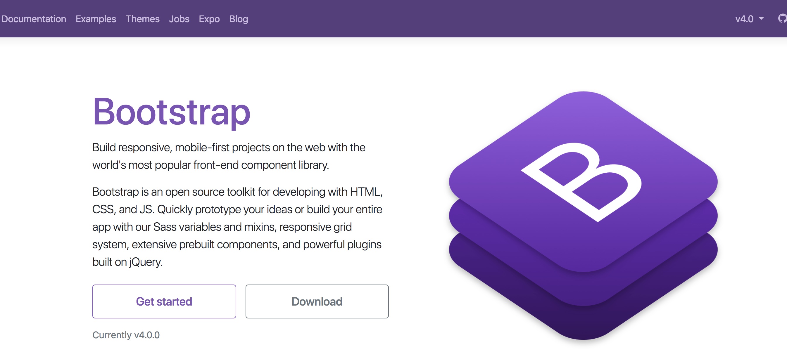
**Bootstrap Homepage**
</center>
Across the course of this tutorial, you will delve into some of the interesting aspects of Bootstrap and see how you can incorporate this framework into your own projects. We will begin by having a look at what Bootstrap is, before including it in one of our own HTML files where we will look into some of the Bootstrap components. While we are not going to explore all of them, because once you have the hang of using a Bootstrap component, you will be able to adapt to using them all, we will be using maybe three or four so you can get the hang of it.
## Folder Structure
Before we go too much further though, lets make sure you have the correct folder structure.
<center>
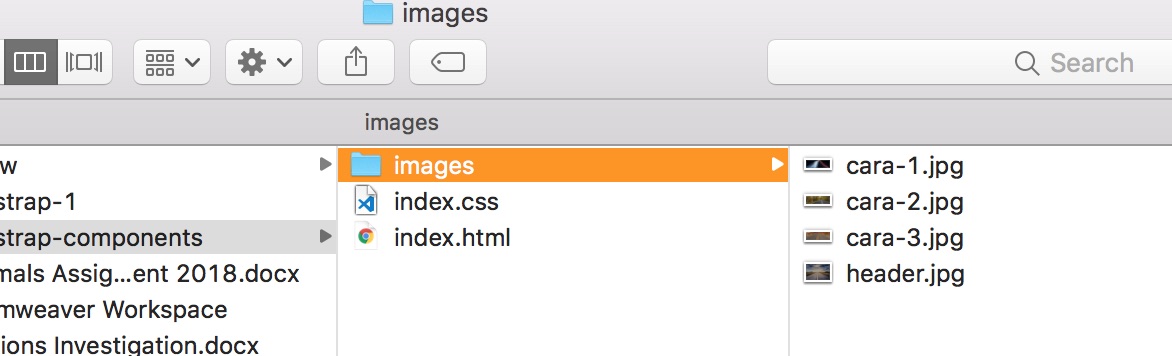
**Proposed Folder Structure**
</center>
As you can see in the image above, I have created a folder that contains 4 images - we will be using them throughout this tutorial. I've also added in an *index.html* and an *index.css* files too. Then, I've wrapped all of them in a root folder called *bootstrap-components*.
Just to summarise the folder structure:
1. Create a root folder called: *bootstrap-components*.
2. Inside of this, create a folder called *images*.
3. Put 4 images into this folder (images).
4. In the bootstrap-components folder, create an *index.html* and *index.css* file.
## Preparing the HTML File
Let's take a quick look at the basic document structure of the index.html file before delving into Bootstrap.
- Open index.html in your favourite text editor.
- Enter the following HTML in the text area:
```html
<!DOCTYPE html>
<html>
<head>
<title>Bootstrap Components</title>
</head>
<body>
<h1>Bootstrap Components</h1>
</body>
</html>
```
- Save you file.
- Open your web browser.
- Open the file you just saved.
- Check to make sure you have the same output as in the image below. You will notice that the only output rendered will be the text you inserted between the ```<h1>``` tags.
<center>
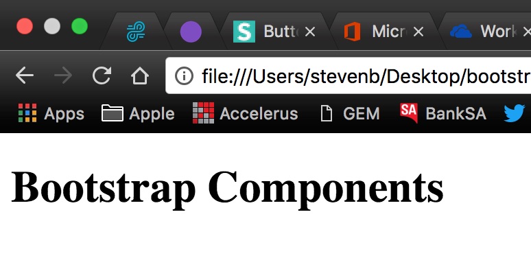
**Output After Initial HTML Setup**
</center>
Before we move on to Bootstrap itself, we need to add in just a couple more elements to our HTML file. These are not necessarily required, but will pass data to the browser. It is good practice to leave them in, so I would suggest building these into your workflow. If you already use a tool like [Emmet](https://emmet.io/), then these tags would have been inserted for you:
- In your text editor, place your cursor at the end of the opening ```<head>``` tag (this should be on or around line 3).
- Insert the following into your document:
```html
<meta charset="UTF-8" />
<meta name="viewport" content="width=device-width, initial-scale=1.0" />
<meta http-equiv="X-UA-Compatible" content="ie=edge" />
```
- Save your file.
## Preparing Bootstrap
> Build responsive, mobile-first projects on the web with the world's most popular front-end component library.<br />
> Bootstrap is an open source toolkit for developing with HTML, CSS, and JS. Quickly prototype your ideas or build your entire app with our Sass variables and mixins, responsive grid system, extensive prebuilt components, and powerful plugins built on jQuery.
The quote above comes from the Bootstrap home page. To summarise, Bootstrap is essentially a series of pre-written CSS and JS libraries that help you to quickly create responsive websites. Bootstrap offers a variety of components that help you to build your site upon, and if you take the time to navigate around their site a bit, you will find that there are also a wide range of pre-made templates available. However, these are usually for purchase, so I tend to steer clear of these.
The first thing you need to do when working with Bootstrap is include it in your files. It is important to note, that you must include Bootstrap on *every* HTML page you want to use it with.
There are three ways of including Bootstrap in your files.
1. The first is to [download](https://getbootstrap.com/docs/4.0/getting-started/download/) the files and save them locally in the relevant places within your website's folder structure.
2. Next, you could choose to link via a [CDN](https://getbootstrap.com/docs/4.0/getting-started/introduction/#quick-start).
3. Finally, you could use [npm](http://getbootstrap.com/docs/4.0/getting-started/download/#package-managers) and install them that way.
For the purposes of this tutorial, we will be using a CDN, or content delivery network. Now, if you use the link above, you will be taken to the Bootstrap CDN section of their Getting Started page. Scroll down a little, and you will notice a starter template.<br />
You might be asking, *'Well, why did I have to write all of the HTML in the previous section if I could have just copied and pasted from Bootstrap?'*<br />
My answer is, *'If you are new to writing websites, then the practice of writing the basic document structure is important, so you are now more knowledgeable about some of the most important HTML elements. You're welcome! And if you already know a bit about Bootstrap, then you probably went directly there anyway!'*<br />
So lets include Bootstrap into our *index.html* document.
- Navigate to the [Bootstrap](http://getbootstrap.com/docs/4.0/getting-started/introduction/) website.
- Use the Quickstart button on the home page to go to the Introduction page. Just there, are some links. These are the ones we will be using. Bootstrap has included some instructions on where to place these, but we will run through them now together.
- Copy the ```<link>``` information using the copy button in the top right-hand corner of the code box.
<center>
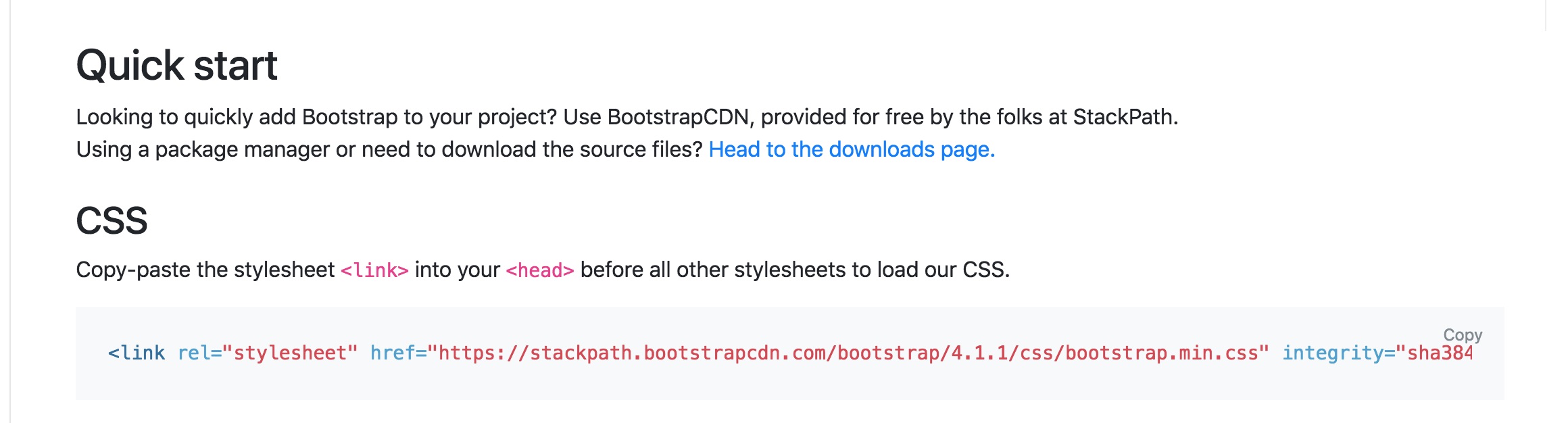
**Link Line Required For Bootstrap CSS**
</center>
- Paste this line in your ```<head>``` section, directly after the last ```<meta>``` line, but before the ```<title>```. For me it will be pasted to line 7.
- Next, scroll down slightly on the Bootstrap website and select the three lines of code for the JavaScript components.
<center>
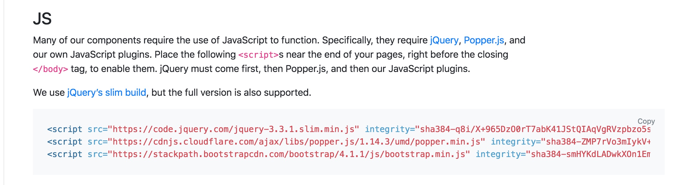
**Script Tags Required For Bootstrap's JS Files**
</center>
- Paste these lines at the very bottom of the ```<body>``` section, directly above the ```</body>``` tag. For me, this will be on line 12.
- Save your HTML file and refresh the browser window. The text here should have changed to be of a slightly more friendly font-family. See the image below:
<center>
**Browser Render After Bootstrap Installation**
</center>
If, for some reason, your render does not look like this, check the code sample below - it is how your full *index.html* file should be looking now. Make any changes you need and continue on.
```html
<!DOCTYPE html>
<html lang="en">
<head>
<meta charset="UTF-8">
<meta name="viewport" content="width=device-width, initial-scale=1.0">
<meta http-equiv="X-UA-Compatible" content="ie=edge">
<link rel="stylesheet" href="https://stackpath.bootstrapcdn.com/bootstrap/4.1.1/css/bootstrap.min.css" integrity="sha384-WskhaSGFgHYWDcbwN70/dfYBj47jz9qbsMId/iRN3ewGhXQFZCSftd1LZCfmhktB" crossorigin="anonymous">
<title>Bootstrap Components</title>
</head>
<body>
<h1>Bootstrap Components</h1>
<script src="https://code.jquery.com/jquery-3.3.1.slim.min.js" integrity="sha384-q8i/X+965DzO0rT7abK41JStQIAqVgRVzpbzo5smXKp4YfRvH+8abtTE1Pi6jizo" crossorigin="anonymous"></script>
<script src="https://cdnjs.cloudflare.com/ajax/libs/popper.js/1.14.3/umd/popper.min.js" integrity="sha384-ZMP7rVo3mIykV+2+9J3UJ46jBk0WLaUAdn689aCwoqbBJiSnjAK/l8WvCWPIPm49" crossorigin="anonymous"></script>
<script src="https://stackpath.bootstrapcdn.com/bootstrap/4.1.1/js/bootstrap.min.js" integrity="sha384-smHYKdLADwkXOn1EmN1qk/HfnUcbVRZyYmZ4qpPea6sjB/pTJ0euyQp0Mk8ck+5T" crossorigin="anonymous"></script>
</body>
</html>
```
<br />
## Introduction to Components
Bootstrap components can be visited by heading to the [Components](http://getbootstrap.com/docs/4.1/components/alerts/) page using the menu on the left-hand side of the Bootstrap website. Once there, you will get an expanded list of components you can scroll through. Generally speaking, components are pre-made by defining CSS classes and applying the necessary rules needed to give them their appearance, jQuery is then used to apply any animations or actions that the component may require.
We will be looking at three components over the rest of this tutorial:
1. Navbar
2. Jumbotron
3. Carousel
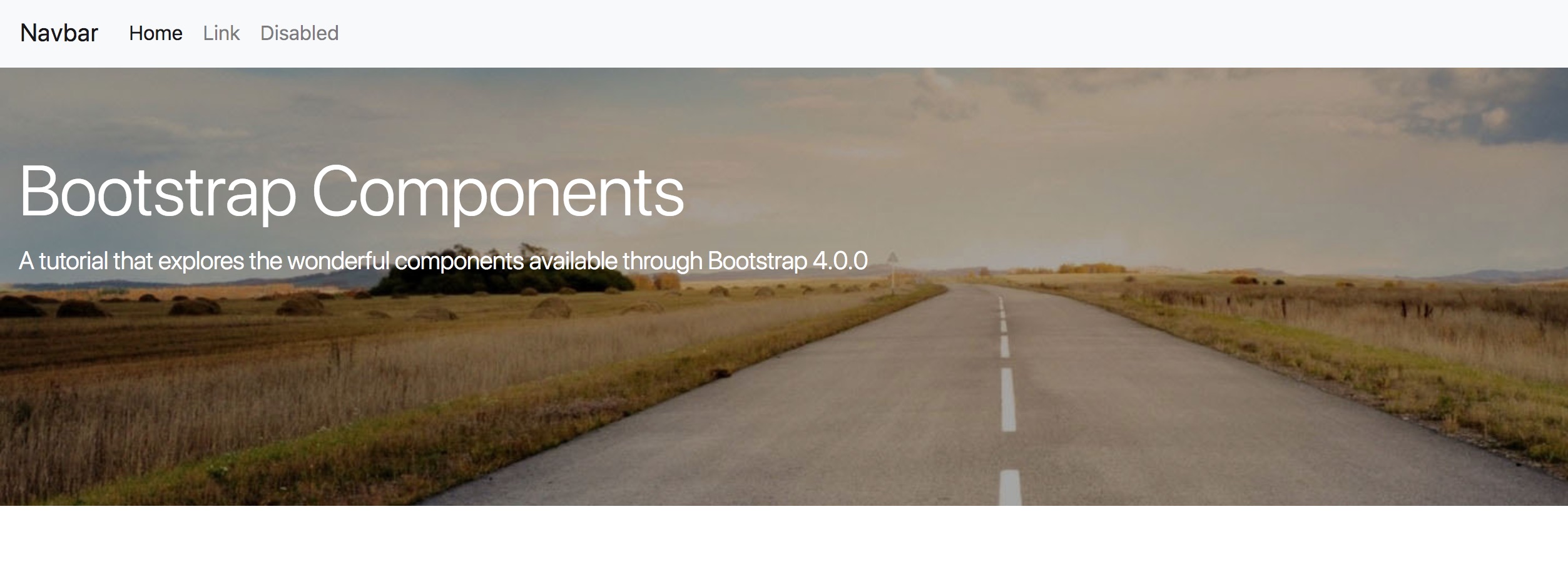
### Navbar
Bootstrap has two variants of navigations: *navs* and *navbars*. While they might seem to be similar, they are in fact quite different. Navs tend to be much simpler (and cleaner), whereas, navbars offer more robustness and access to quite a few sub-components, such as drop down menus and forms. Navs are also much easier to customise than navbars.
The navigation that we are going to insert is found under the Navbar section and is essentially the first one you come to once you have clicked on this menu item. The navbar we want looks like the following:
<center>
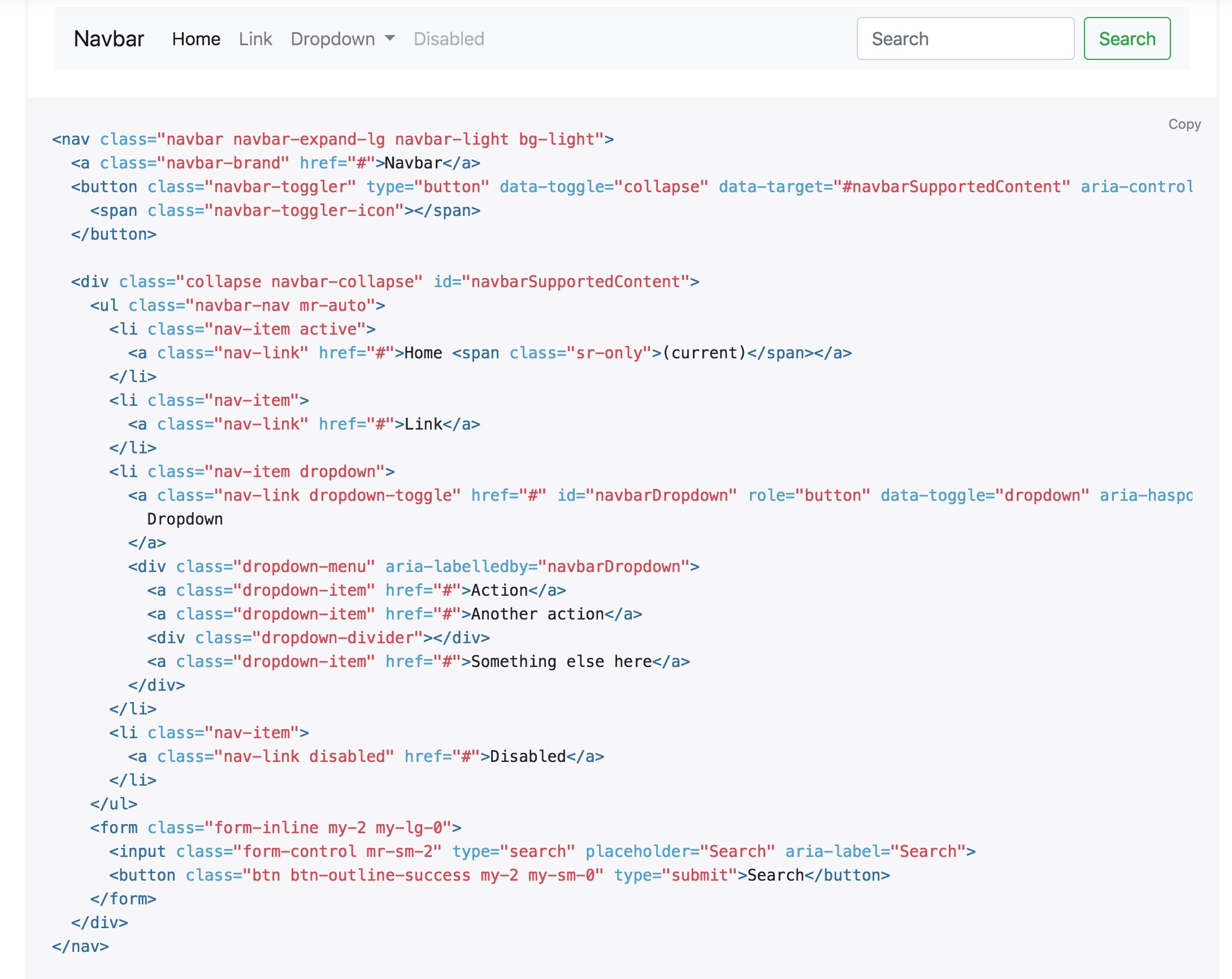
**Navbar We Will Be Inserting**
</center>
To insert this navbar into your HTML file, follow the steps below:
- Navigate to the correct section of the Bootstrap site - found [here](https://getbootstrap.com/docs/4.0/components/navbar/)
- Press the Copy button in the top-right section of the code panel.
- Switch to your *index.html* file.
- Insert your cursor after the opening ```<body>``` and press Enter/Return. I'm on line 11 - you should be somewhere near that.
- Paste the navbar markup copied in the second step.
- Save your HTML file.
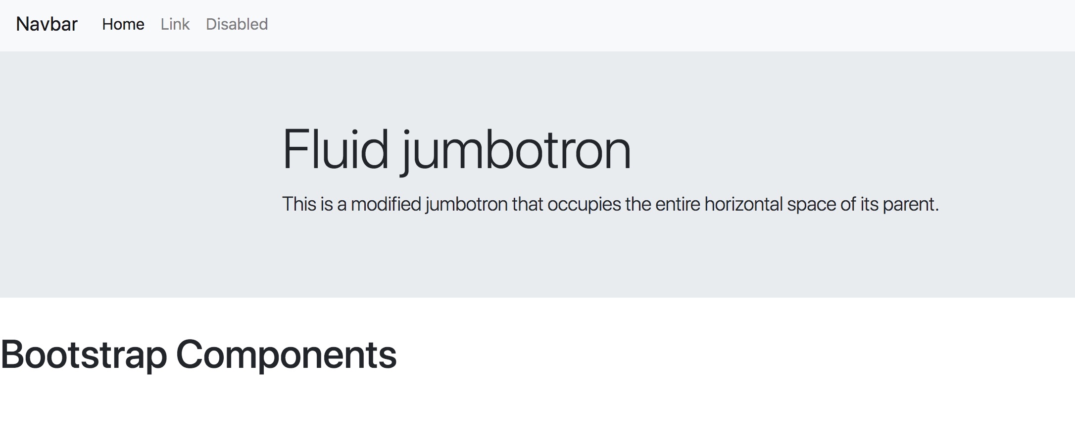
Switch to the browser window and you should see the following output:
<center>

**Navbar In The Browser**
</center>
A quick breakdown of the components included in the navbar, from left to right are:
1. Brand - a place for the company logo/title. Usually link back to the home page/top of the site.
2. First navigation links (Home and Link).
3. Dropdown example.
4. Disabled link example.
5. Search bar and submit button using forms - this also shows how you can pull items to the right of the navbar.
Let's remove the dropdown and the search bar, and change the disabled button to be enabled to customise this a little.
- Head back to your text editor and locate the code for the dropdown. For me, it is on lines 25 to 35 and looks like this:
```html
<li class="nav-item dropdown">
<a class="nav-link dropdown-toggle" href="#" id="navbarDropdown" role="button" data-toggle="dropdown" aria-haspopup="true" aria-expanded="false">
Dropdown
</a>
<div class="dropdown-menu" aria-labelledby="navbarDropdown">
<a class="dropdown-item" href="#">Action</a>
<a class="dropdown-item" href="#">Another action</a>
<div class="dropdown-divider"></div>
<a class="dropdown-item" href="#">Something else here</a>
</div>
</li>
```
- Press delete to remove these lines.
- Next locate the markup for the form for me it is located on lines 39 to 32 (remember we have now removed the dropdown), and looks like this:
```html
<form class="form-inline my-2 my-lg-0">
<input class="form-control mr-sm-2" type="search" placeholder="Search" aria-label="Search">
<button class="btn btn-outline-success my-2 my-sm-0" type="submit">Search</button>
</form>
```
- Press delete to remove these lines.
- Finally, locate the nav link with a class of disabled included. For me it is on line 26. Simply highlight and delete the word *disabled* and that will remove this class.
- Save your HTML file and switch to your browser. Refresh and you should see an output similar to below - note the form on the right and the dropdown are gone, and the disabled button (even though it still says displays as disabled) is now active like the rest:
<center>

**Customised Navbar**
</center>
Excellent! Let's move on to the next section where you can see how to insert a jumbotron.
### Jumbotron
Yep, a jumbotron is just like what it sounds - a large area where you can really highlight different content on your site. To see some specifications, use the menu on the left of the Bootstrap website to navigate to the jumbotron section. For our purposes here, we will be using the second example's code to create a jumbotron that expands the width of the body and does not have rounded corners.
- So, we will begin by copying the markup for the fluid jumbotron.
- Switch to your text editor and insert your cursor at the end of the ```</nav>``` line. For me it's line 31.
- Press Enter/Return and paste in the content of your clipboard.
- Save your *index.html* file and switch to the browser. Refresh and you should see:
<center>
**Rendered Jumbotron**
</center>
We will move the text in the container to the left a bit, so locate the line that says ```<div class="container">```, and alter it to look like this: ```<div class="container-fluid">```. Save and refresh and your text will have moved closer to the left margin.
Now, lets add some custom styles to this jumbotron. We have not linked out custom stylesheet to our HTML yet, so we will need to do this first. Once this is accomplished, we can begin to add in some changed. We will change the colour of the text and add in a background image, so make sure you acquired some as you were asked to do at the beginning of this tutorial.
- Switch to your text editor.
- In the ```<head>``` section, find the last ```<link>``` element you inserted and place your cursor at the end of this line.
- Press Return/Enter. You will be on or close to line 8.
- Copy the following text: ```<link rel="stylesheet" href="index.css" />```. Providing you set up your folder structure the same as me, this should link to your *index.css* just fine.
- Now open you *index.css* if it isn't already and switch to this file. We are going to insert some CSS on the Bootstrap class of ```.jubmotron```.
- Enter the folowing rules:
```css
.jumbotron {
background-image: url(images/header.jpg);
background-position: center;
background-repeat: no-repeat;
background-size: cover;
height: 350px;
color: white;
}
```
- Now, we will remove our ```<h1>Bootstrap Components<h1>``` from line 38 and put it into the jumbotron instead (you can also alter the lead text if you like (the text within the ```<p>``` tag). Your jumbotron should now look like the following:
<center>
**Customised Jumbotron**
</center>
In the final section of this components part, we will have a look at the carousel.
### Carousel
The Bootstrap carousel offers a variety of methods to quickly and easily display a slideshow of images. There are plenty of options available on the Bootstrap website, such as plain carousels, ones with controls and indicators. You can also have captions at the bottom too, so you shouldn't have too much difficulty finding something that suits your site.
For the purposes of this tutorial, we will look at the third example down - With Indicators, and then add in the caption options. We will also be sticking with the default number of slides, which is three, but I will indicate the markup you could be copying and pasting to add in more slides if you wanted.
- Lets begin by navigating to the Carousel section of the Bootstrap website by using the menu on the left-hand side.
- Once there, scroll to the correct part of the page - use the screenshot below of you are unsure:
<center>
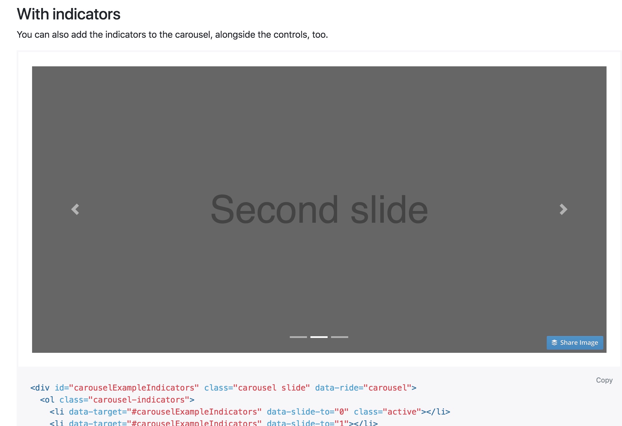
**Carousel To Be Using**
</center>
- Use the Copy button on the page to copy the contents to the clipboard.
- Navigate to your text editor.
- Locate the closing ```</div>``` of your jombotron and place your cursor at the end of the line. Mine is on line37.
- Press Enter/Return.
- Paste the carousel contents into the space now provided.
- Save and refresh your browser. If you are like me, you will see something like the screenshot below:
<center>
**Carousel Render**
</center>
Not very impressive, huh? Ignore your first impulse to panic - you haven't done anything wrong. Stop and watch your page for a while and you will notice that the carousel is actually working - it just doesn't have any images in it yet. Let's fix that now.
- Navigate back to your text editor.
- Follow the HTML down from the start of the carousel code until you come to the first ```<img>``` tag. You will notice as you read this line, that the ```src="..."```. Those ```...``` are a placeholder for you to insert the file path to your own image.
- Place your cursor at the placeholder dots and delete all three of them.
- Now write in the file path you have for your first image. My line of code now looks like this:
```<img d-block w-100" src="images/cara-1.jpg" alt="First Slide" />```
- Save your HTML and refresh in your browser. You should see the first image now appearing.
- Repeat this process with the remaining two ```<img>``` tags, using your other two images. Save and refresh - you can wait for the carousel to automatically scroll, or if you're a bit impatient, you can use the arrows on the left or right to move the images.
Now we want to put in some captions.Back at the Bootstrap website, there is an example of how to do this, just below the with indicators example we just used. Scroll to this. You can see that there is a small block of code, just below the example. We want to copy some of this to the clipboard because we already have some of the code from the previous steps.
- Select **only** the code as follows:
```html
<div class="carousel-caption d-none d-md-block">
<h5>...</h5>
<p>...</p>
</div>
```
- Copy it to the clipboard.
- Move back to your text editor.
- Place your cursor at the end of the first ```<img>``` line. For me it is on line 46. Press Return/Enter.
- Paste in the caption code and replace the contents with something more meaningful. You will see your caption appear just above the indicator line:
<center>

**Caption Render**
</center>
Okay - going well!
If you would like to add more images to your carousel, you will need to do a couple of thing. The first is to copy and paste the code for the carousel item, them you will need to add in an extra indicator.
- In your text editor, scroll towards the bottom of the carousel code.
- Find the code block that is the following and copy it:
```html
<div class="carousel-item">
<img class="d-block w-100" src="images/cara-3.jpg" alt="Third slide">
<div class="carousel-caption d-none d-md-block">
<h5>Bootstrap Carousel 3</h5>
<p>This is the third image in a series of three.</p>
</div>
</div>
```
- Then, under the closing ```<div>``` of that block, paste it in.
- Change the text between the ```<h5>``` and ```<p>``` tags, and add in a new image link, and save your work.
- Next, scroll up to the carousel indicators code. Mine are located on lines 40 - 42.
- Copy the last indicator line. It looks like this: ```<li data-target="#carouselExampleIndicators" data-slide-to="2"></li>```.
- Paste it one the very next line and change the ```data-slide="2"``` to ```data-slide="3"```.
- Save your work and refresh your browser. You should now have four indicators and a brand new slide.
## Saving to a Repo
So that is pretty much the end of the tutorial. Thank you so much for following along. I hope that you've learned something useful and valuable.
Before we wrap up completely though, we should save our work properly. I'm going to save to Git and then push it up to GitHub. I'm not going to go into as much detail here, but will quickly step you through the process I'll take. I am assuming here that you already have Git and GitHub set up.
1. Create a new repo on GitHub.
2. Open the Terminal on your machine and cd into your project folder.
3. Start a new Git repo - ```git init```.
4. Check the untracked files - ```git status```.
5. Add everything to the next commit - ```git add .```. (You can do ```git status``` again here if you want to see the files that will be added).
6. Commit the new files with a message - ```git commit -m 'Initial commit'```.
7. Follow the instructions on GitHub to push everything there.
And everything should be nicely saved to GitHub. Again, thank you so much for following along. Please feel free to leave any comments you may have, ask a question, or make a suggestion for a future tutorial below.
---
#### Proof of Work Done
https://github.com/InventivName/bootstrap-components
https://d.tube/#!/v/steveblucher/d9y0f80a