Playing with AI art - Do you hear what I hear? Time to play with words!
onchainart·@stickupboys·
0.000 HBDPlaying with AI art - Do you hear what I hear? Time to play with words!
## AI Let's work with a key element known to Brighton and see if we can play around with enhancing it to our favour. Our last experiment showed us that it's all in the details and the more specific we are with what we need the generator to do, in some instances, it listens. So let's give it a run for it's money and get more descriptive, listen up, AI! ## Source image This was the source image 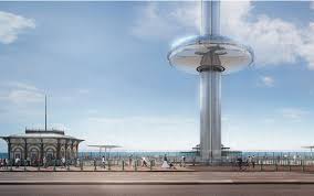 ## Image 1 Text - add graffiti to the buildings, make it feel more grunge-like without losing on the colour, and really highlight the key elements in the picture Style - default 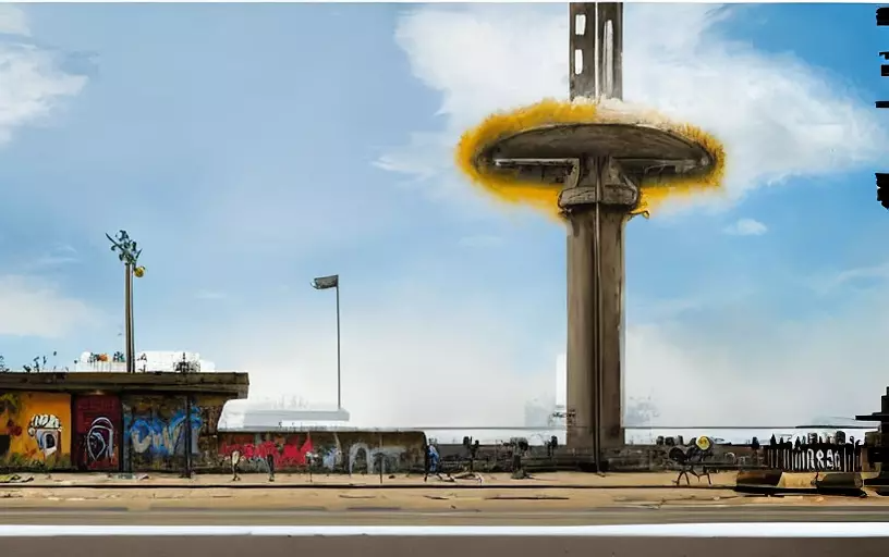 Great job on adding the graffiti and elevating the urban pitch. The i360 just looks like it's some sort of UFO lit on fire. Perhaps it's because I asked it to highlight the key elements in the pic, it literally highlighted it by blowing it up in flames! ## Image 2 Text - add graffiti to the buildings, make it feel more grunge-like without losing on the colour, and really highlight the key elements in the picture Style - Ghibli Studio 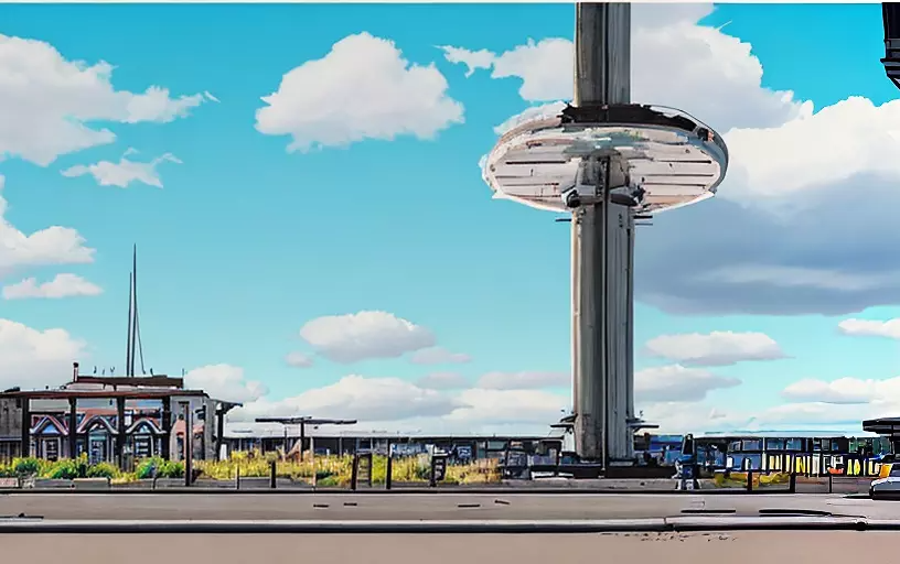 I was happy with the verbiage and interested to see it in a different style before tampering with it. Looks like our good friend Ghibli has brought back our hand drawn element, but it's compromised the graffiti effect. Does it still feel urban? Falling into the disney-feel with the clouds, so perhaps not so much.... ## Image 3 Text - add graffiti to the buildings, make it feel more grunge-like without losing on the colour, and really highlight the key elements in the picture Style - Fantasy 3D 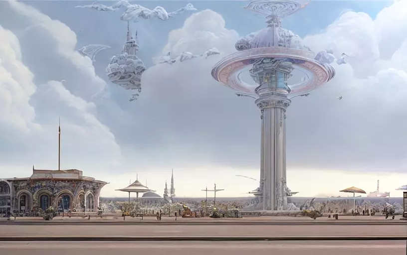 Final shot with the same text to see if the Fantasy style can change things up, but it's pretty much done exactly what you would expect it to do with Fantasy. It's made it into a scene fresh out of the Final Fantasy video game. It's lost all it's colour and turned it more futuristic than urban. ## Image 4 Text - add graffiti to the buildings, add more colour to the image, but make it look grungy and dirty. add elements to the pole to make it more rough and urban. Style - default 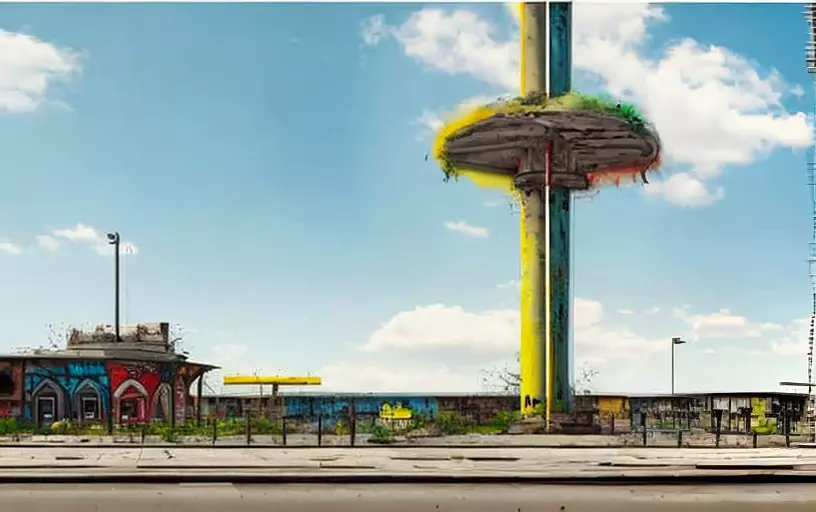 Trying to keep the specificity of the text to tell it exactly what to do. Asking it to add colour really helped and makes me think if for previous tests I should have asked it to add colour so that it could still keep the urban vibe without muting everything to make it look grungier. ## Image 5 Text - add graffiti to the buildings, add more colour to the image, but make it look grungy and dirty. add elements to the pole to make it more rough and urban. Style - Ghibli Studio 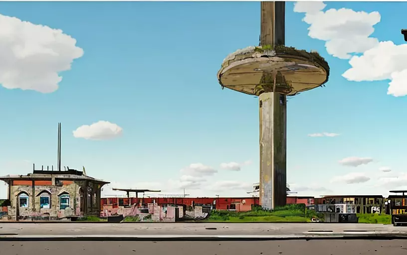 The last one was definitely my fave so far, but wanted to add the sketch element back, so thought I'd give Ghibli a stab at it. Interestingly, it hasn't added as much colour as the default try, but it has kept that 'run-down' look, so I am still getting the urban vibe, but a bit more post-apocalyptic. And it hasn't turned it into a sketch as much as I had hoped, perhaps because the details are so far away.... ## Image 6 Text - add graffiti to the buildings, add more colour to the image, but make it look grungy and dirty. add elements to the pole to make it more rough and urban. Style - sketch 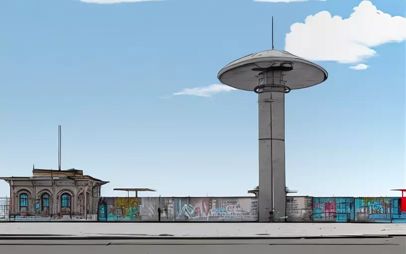 Interested to see if Sketch automatically turns it into black and white, even when I ask it to add colour in the text. And it worked! Switching this up to be my new fave, it's definitely the most urban-feeling and keeps that hand sketched element that works really well with the overall vibe we're trying to achieve. ## Image 7 Text - add graffiti to the buildings, add more colour to the image, but make it look grungy and dirty. add elements to the pole to make it more rough and urban. Style - Cartoon 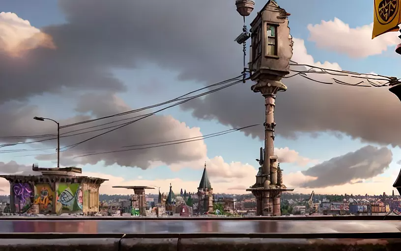 The last one worked out so well, I got greedy with keeping the text and having a gamble with cartooning it up! And now we've gone completely rogue and it's decided to transform the i360 into a home and add some cable lines to it. I do like how this one has still kept the graffiti look and feel even thought it's trying to make it look cartoony, at least we now know that cartoon doesn't automatically mean Disney! ## Image 8 Text - add graffiti to the buildings, add more colour to the image, add more details to the image, add people that are urban and cool, make the main pole structure more interesting Style - default 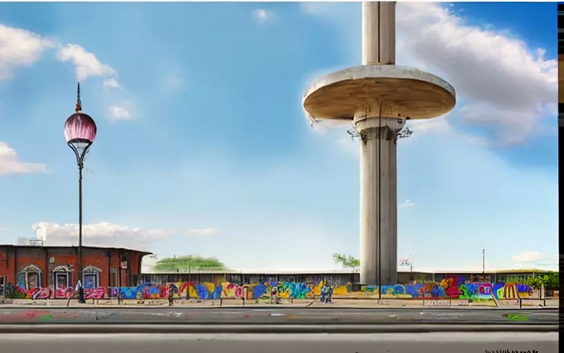 Let's get specific and detailed! I like this one, it has matched most of the brief, although I don't see people in it. But the added colour works really well and this is much more believable of an urban sketch effect than any of the others. Happy to wrap up with this one! ## Conclusion This was a great test of details and focus on text. The image itself was quite limited on detail, which makes me think if that will affect the outcome. If you have a less detailed image and ask it to add more detail, will it listen and work better to achieve the outcome you want, versus an image that has too much detail and it doesn't know what to even begin to work with? We appreciate all the support we get from the Hive community. Remember that you can earn 15% APR paid in Legion, in daily dividends, if you delegate Hive Power to @stickupcurator. By doing so, you also support music and art on Hive because that’s our main focus when curating. You can buy our records on our favourite blockchain game Rising Star or at the awesome NFT Tunz. We also have our own art, video and GIF NFTs on NFT Showroom. For more information or to give us a follow, check out all our socials and say hello! https://www.stickupboys.co.uk
👍 norwaylife, joeyarnoldvn, doze, whywhy, franciscodesousa, hiveopenmic, killerwot, azj26, growandbow, wearelegion, cryptocompany, sammyhive, uygames, nordsteorra, powerpaul, photomoto, stmctrail, jsalvage, solymi, flexnet, mugglow, ccracing, ccnewsflash, hive-196769, ccceo.wallet, aborowczak1972, ccceo.team, ccceo.invest, ccceo.market, brobang, kingswill, flamo, zugs, supu, eforucom, grapthar, unpopular, hive-180580, teamvn, fnvdesigns, blueeyes8960, nyxlabs, sbi3, raj808, sbi-tokens, sneakyninja, mastergerund, blockchainyouth, thedailysneak, clubvote, cryptoknight12, tokenpimp, brofi, bellou61, upfundme, athunderstruck, bozz.sports, hive-111011, pimptoken, zwhammer, stickupmusic, pimpdistrict, thepimpdistrict, ydaiznfts, ma3str0, ifhy, stickupcurator, strenue, dibblers.dabs, hetty-rowan, tenkminnows, groove-logic, robvector, hmvf, stephenezike, meesterboom, mountainjewel, newageinv, uncorked-reality, wannatrailwithme, dannewton, thehive, thecryptopimp, biglove, lordnasty, huckleberrie, eternalpaw, pixelfan, earthsea, buzzbee, marshalmugi, acta, the-table, silverquest, tommys.shop, hucksbucks, rocco-maloney, tslu, tsjen, stewiekobe, choco11oreo11, emaillisahere, podg3, thehouse, almightygrim, dnrxgwp2021, sdoyle, leighscotford, coltdelegation, quinnertronics, jfuji, jackmiller, goblinknackers, matildamoment, cmmndrbawang, blocktunes, junkfeathers, brofund-witness, nicklewis, ambrosechappel, cardtrader, svanbo, slothlydoesit, anandkj611, wisbeech, lakawero, slothburn, thelogicaldude, blocktunesdao, penguinpablo, cryptonized, funnyman, alphacore, hungrybear, jacuzzi, b00m, citizensmith, vida-blanca, hivelist, hive.friends, dickturpin, pizzadalek, hivehustlers, mytechtrail, russellstockley, maddogmike, hankanon, kam5iz, aafeng, ecencypoints, gr33nm4ster, sweetgemstone, konchix, gr33nsquad, sazbird, daltono, the13anarchist, brutus22, edb, marsupia, slothbuzz, bagpuss, cute-cactus, steevc, liotes.burn, kingneptune, ctpsb.stem, ph1102.bee, beetrader, definethedollar, wenchebakken, mythix, mythix.market, mythix.token, digi-me, ugochill, farpetrad, fw206, cuddlekitten, dadspardan, thatgermandude, silverd510, frankashby, agmoore, master-lamps.ccc, thebighigg, writeandearn, diamondcare, youarecreative, halleluyah, anicom.vote, girlcrypto, duncanek, mickymouse, hurtlocker, waivio.welcome, catnet,