css3应用(1):字体投影text-shadow css3 apllicaton(1): shadow of text
technology·@tvb·
0.000 HBDcss3应用(1):字体投影text-shadow css3 apllicaton(1): shadow of text
<h1>▶▶1 [引言/preface]</h1>
今天在 @nicolemoker 那里看到<a href="https://steemit.com/steemit/@nicolemoker/study-design-with-nicole-8-steemit-s-cover-image-8-steemit#@tvb/re-nicolemoker-study-design-with-nicole-8-steemit-s-cover-image-8-steemit-20170815t094700366z">制作封面照片</a>的博文。
<h6>细心的朋友会发现 steemit的字体有了小小的变化</h6>
>Circumspective can find that there's something changed in the font of head of steemit.
>We can see clearly from the picture below:
<h6>看下面这里会更明显一些</h6>

是的,字体下边多了投影。这种效果是通过css3的实现的(IE9以及以下版本不支持)。
>That's right, there apears shadow under the words. This effect is realized by CSS3(IE9 and the following versions are not supported).

第二天可能是发现这里不太顺眼,又改回去了。The second day, the designer found this not good-looking, then change back to the original.
_________________________________________________________________________________________________
<h1>▶▶2 [实践/practice]</h1>
<h5>于是我也试了一下: Then let me have a try:</h5>
<style>
.test{
background:#639;
padding:20px;
font-size:14px;
color:#fff;
text-shadow:4px 4px 3px #333;
-webkit-text-shadow:4px 4px 3px #333; //just for compatibility 只是为了兼容性,测试过没啥用,留着以防外一
-moz-text-shadow:4px 4px 3px #333;//just for compatibility 只是为了兼容性,测试过没啥用,留着以防外一
}
</style>
<div class="test">
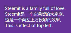
Steemit is a family full of love.
<br>Steemit是一个充满爱的大家庭。
</div>
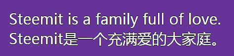
<h5>效果如下:effect is as follow:</h5>
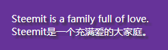向右下方投影/bottom right shadow
优点就是在不支持css3的浏览器下,也不影响正常的显示。而在支持css3的浏览器上,可以增加美感。
>Advantage is in the browse not supporting css3, we also can see the ordinary design. While in the browse supporting css3, we can get better-looking.
_________________________________________________________________________________________________
<h1>▶▶3 [详解/description]</h1>
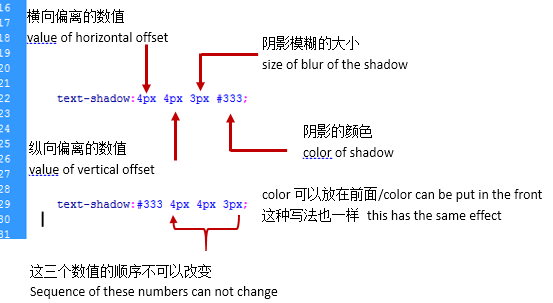
第一个数值:向右偏离的数量,负数表示向左偏离的数量。
The first number: ammount of right offset, and the negative number is ammount of left offset.
第二个数值:向下偏离的数量,负数表示向上偏离的数量。
The second number: ammount of bottom offset, the negative number is ammount top offset.
text-shadow:-4px -4px 3px #333;
第三个数值:阴影模糊的大小。该数越大,阴影扩展的面积也就越大,当然颜色会越浅。
The third number, the size of shadow blur. The larger the number is, the area of the shadow is bigger, and the color of the shadow is lighter.
color:投影的颜色。
color: the color of the shadow.
_________________________________________________________________________________________________
<h1>▶▶4 [扩展/spread]</h1>
<h6>①描边/stroke</h6>
<style>
.test{
background:#639;
padding:20px;
margin-bottom:50px;
font-size:30px;
color:#fff;
text-shadow:0px 1px 0px #000, 1px 0px 0px #000, -1px 0px 0px #000, 0px -1px 0px #000;
-webkit-text-shadow:0px 1px 0px #000, 1px 0px 0px #000, -1px 0px 0px #000, 0px -1px 0px #000;
-moz-text-shadow:0px 1px 0px #000, 1px 0px 0px #000, -1px 0px 0px #000, 0px -1px 0px #000;
}
</style>
<div class="test">
Steemit is a family full of love.
<br>Steemit是一个充满爱的大家庭。
</div>
text-shadow:0px 1px 0px #000, 1px 0px 0px #000, -1px 0px 0px #000, 0px -1px 0px #000;
这种写法是把四个方向分开来号,中间用逗号隔开。
四个方向分别偏移1px,刚好是在字体周边1px。而模糊值设为0,表示是清晰的,也就是描边的线条。
>Write four directions separately, then use comma to separate them.
The offset of four directions is 1px, aroud the font. The blur is 0, that makes clear linellae to stroke.
<h6>②外发光/outer glow</h6>
<style>
.test{
background:#639;
padding:20px;
margin-bottom:50px;
font-size:30px;
color:#fff;
text-shadow:0px 1px 15px #ff9933, 1px 0px 15px #ff9933, -1px 0px 15px #ff9933, 0px -1px 15px #ff9933;
-webkit-text-shadow:0px 1px 15px #ff9933, 1px 0px 15px #ff9933, -1px 0px 15px #ff9933, 0px -1px 15px #ff9933;
-moz-text-shadow:0px 1px 15px #ff9933, 1px 0px 15px #ff9933, -1px 0px 15px #ff9933, 0px -1px 15px #ff9933;
}
</style>
<div class="test">
Steemit is a family full of love.
<br>Steemit是一个充满爱的大家庭。
<br>我是凹字/I'm concave.
</div>
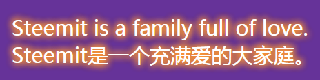
将第三个数值设置大一些,就会在字体周围形成外发光的效果。
>Set the third number larger, that can make the outer glow effect.
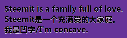
<h6>③3D凹字/3D concave text</h6>
<style>
.test{
background:#639;
padding:20px;
margin-bottom:50px;
font-size:30px;
font-weight:bold;
color:#000;
text-shadow:0px 1px 1px #fff;
-webkit-text-shadow:0px 1px 1px #fff;
-moz-text-shadow:0px 1px 1px #fff;
}
</style>
<div class="test">
Steemit is a family full of love.
<br>Steemit是一个充满爱的大家庭。
</div>
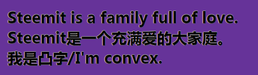
<h6>④3D凸字/3D convex text</h6>
<style>
.test{
background:#639;
padding:20px;
margin-bottom:50px;
font-size:30px;
font-weight:bold;
color:#000;
text-shadow:0px -1px 0px #999, -1px 0px 1px #ddd, 0px 1px 0px #333;
-webkit-text-shadow:0px -1px 0px #999, -1px 0px 1px #ddd, 0px 1px 0px #333;
-moz-text-shadow:0px -1px 0px #999, -1px 0px 1px #ddd, 0px 1px 0px #333;
}
</style>
<div class="test">
Steemit is a family full of love.
<br>Steemit是一个充满爱的大家庭。
<br>我是凸字/I'm convex.
</div>
<h6>⑤3D字/3D text</h6>
<style>
.test{
font-family:Arial, Helvetica, sans-serif;
background:#639;
padding:20px;
margin-bottom:50px;
font-size:60px;
font-weight:bold;
color:#000;
text-shadow: 1px -1px 0px #ccc,2px -2px 0px #ccc,3px -3px 0px #ccc,4px -4px 0px #ccc,5px -5px 0px #ccc, 6px -6px 0px #ccc;
-webkit-text-shadow:1px -1px 0px #ccc,2px -2px 0px #ccc,3px -3px 0px #ccc,4px -4px 0px #ccc,5px -5px 0px #ccc, 6px -6px 0px #ccc;
-moz-text-shadow:1px -1px 0px #ccc,2px -2px 0px #ccc,3px -3px 0px #ccc,4px -4px 0px #ccc,5px -5px 0px #ccc, 6px -6px 0px #ccc;
}
</style>
<div class="test">
Steemit is a family full of love.
<br>Steemit是一个充满爱的大家庭。
<br>我是立体字/I'm 3D.
</div>
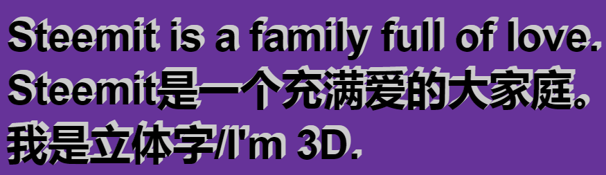
text-shadow属性是可以叠加的,通过叠加可以实现以上立体的效果。通过灵活使用,可以实现更多的漂亮的字体,期待你的发现!
>text-shadow can be used togethor, that can make the 3D effect above. By creative using, we can get more beautiful text!
<h3>近期文章Recent Blog</h3><a href="https://steemit.com/cn/@tvb/mathematics-programming-competition-4-i-ve-try-please-correct"><h5>Software Engineer Interview Question - How Many Ways from A to C via B? 从A经B到C共有多少条路径 程序解决数学问题之我也试一下</h5></a><h5><a href="https://steemit.com/cn/@tvb/acrostic-poem-of-wonderful-moment">藏头诗:七绝-精彩瞬间(中华新韵)Acrostic Poem of Wonderful Moment</a></h5><a href="https://steemit.com/cn/@tvb/mathematics-programming-competition-4-i-ve-try-please-correct"><h5>Software Engineer Interview Question - How Many Ways from A to C via B? 从A经B到C共有多少条路径 程序解决数学问题之我也试一下</h5></a><a href="https://steemit.com/cn/@tvb/36-to-36-years-myself-as-a-female-quasi-programmer"><h5>写给36岁的女性伪程序员的我 To 36-years-myself as a female quasi-programmer</h5></a><a href="https://steemit.com/cn/@tvb/4pnoar"><h5>20170809习联:对联是一种中国古典语言艺术形式 Couplet is an artistic form of Chinese classical language</h5></a><a href="https://steemit.com/cn/@tvb/the-first-but-also-last-love"><h5>第一次绝恋--最后的初恋 The first but also last love</h5></a><a href="https://steemit.com/cn/@tvb/write-a-poem-call-i-am-a-pig"><h5>填词一首:桂殿秋《俺是猪》博君一笑 Write a poem call "I am a pig"</h5></a><a href="https://steemit.com/technology/@tvb/css3-1-text-shadow-css3-apllicaton-1-shadow-of-text"><h5>css3应用(1):字体投影text-shadow css3 apllicaton(1): shadow of text</h5></a><a href="https://steemit.com/poetry/@tvb/original-poetry-to-my-lover"><h5>Original poetry to my lover 填词《眼儿媚》千红易逝,此爱难凋</h5></a><a hre="https://steemit.com/life/@tvb/6btldz"><h5>三件事介绍一下我可爱的妈妈</h5></a>👍 tvb, zhanm, limonka, shenchensucc, tumutanzi, pula78, ryanjk8, aaronli, alli.top, htliao, coldhair, wilkinshui, linuslee0216, redtea, tensaix2j, wseemfree, mrspointm, mrpointp, zsilence, bxt, justyy, susanli3769, drycurrynoodles, johnnyzhou,