PRIVEX Panel Dev Blog - PART 1 - UX
privex·@privex·
0.000 HBDPRIVEX Panel Dev Blog - PART 1 - UX
 --- Firstly, I'd like to say that the largest part of this development by far is the back-end, which involves managing virtualisation software and our billing system. The front-end/User Interface is what I'll be focusing on today, which is just a small part of everything we're working on at @privex _this post does not go into the detail of features within the panel, which will of course be quite simple... After all, it's just an interface for server management._ --- # So how's it going with the Privex Panel? Well, there's still a large chunk of the back-end to complete, but the front-end is coming along quite nicely... <center> 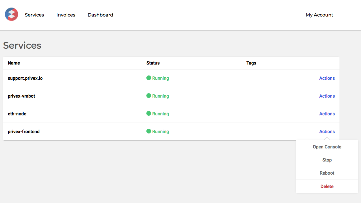 _Design & features subject to change_ </center> As you can see, design-wise, it's quite simple. While I have some experience with design and UX, none of us at Privex really consider ourselves to be Web Designers, and with limited funding, we can't afford to take on someone with those skills... and we're not really sure we _need_ to just yet... In order to achieve a decent-looking and easy-to-use interface, we're trying to keep things minimal and functional. Ideally, the user shouldn't have to think about how to interact with our service. We've avoided CSS frameworks and minimized usage of 3rd-party packages, which does mean we're building all of the little features (such as notifications and modals) ourselves. This enables us to build it the way we want, with the features we want, and never have to worry about something small and silly becoming out-dated. Doing these things ourselves means fewer limitations in the long-run. ### Modals - UX Here's an example of a modal. At first glance, it may not seem like much, but there's more to consider than what meets the eye. 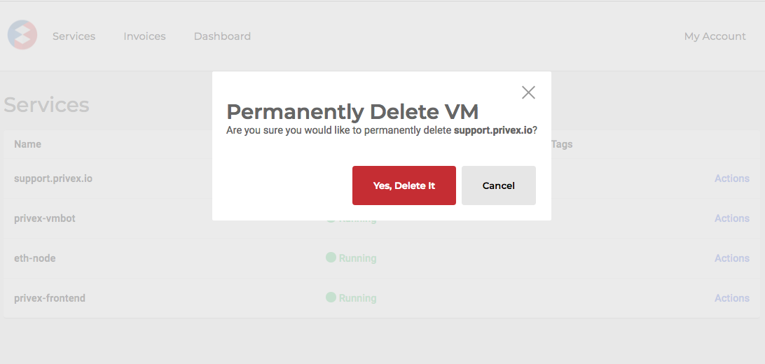 Goals: - Re-usable code - Flexible content (yes/no buttons or text fields, other additional text) - Easy and clear interactions - Multiple ways to exit Firstly, we create a single point of success and highlight it with a bold color. This signals importance and/or danger. Secondly, we create multiple ways to exit the modal. If the customer did not intend to enter the modal screen, we want to them to feel safe about exiting. So we've provided 4 ways to exit: - Cancel Button - Exit (X) button (top right) - Esc Key - Mouse click on the faded background _As you can see, we've taken time to consider how different people interact with their computer, providing them with flexibility where possible, but being specific and leading them down a path when it comes to executing the action to reduce accidents._ ### Notification system - UX We needed to build an notification system to inform the user of the outcome of an action they've taken. 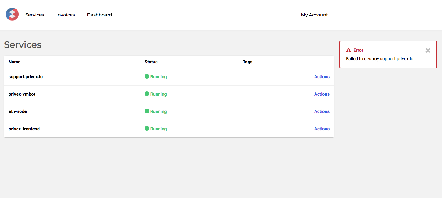 Once again, we needed to: 1. Build a notification box is meant to grab the users attention, so we decided to group and color-code each type of notification (success, fail, warning). The color-coded alert box is good, but taking into consideration color-bind users, we added some icons to give a second visual signal. 2. Ensure notifications are on top of everything and also has to make room for more than one notification to be displayed too. We initially made the notifications fall from the top, but after more than one notification, it became quite intrusive. Without many other options, we moved them to the right of the screen. 3. Add an exit (X) button, because there's nothing more annoying than a notification you can't get rid of! We made sure the button wasn't too tedious to press either. The mobile layout for the alert system (undesigned) may also enable notifications to be swiped away. ### Console 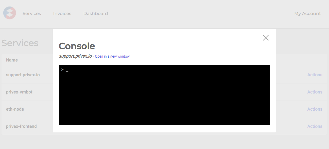 As you can see here, the console to connect to a server sits within our reusable modal! We figure that most user-interactions with the console are short-lived, as most people prefer to user their own client on their computer to interact with their server. We have, however, added a link above the console to open it in a new window, so the customer can keep it open as long they wish, while also being able to continue their interactions with the panel --- <center> ### Thanks! __This was a sneak-peak into the upcoming MVP Privex panel. If you have any questions, suggestions or constructive criticisms, then please do comment below!__ If we see there's interest in our processes, we'll definitely post more in depth and cover other parts of our development You can grab a server from us at https://www.privex.io - we accept STEEM, SBD, LTC, and BTC :) </center>
👍 privex, kemalmustafa, deathbypenguin, felixxx, ausbitbank, nikosnitza, aggroed, someguy123, dangerouslyhigh, alli.top, followbtcnews, brendashockley, nataliejohnson, sciborg, scoobie, donaldpatterson, micayla, dennisphillips, lisamarie, farkparck, acidyo, techslut, steemtruth, jbaker585, pharesim, seablue, steempty, fminerten, thinknzombie, willbeonceagain8, reggaemuffin, kosmatimuc, greenbigfrog, wackou, christoryan, lenatramper, future24, mrblinddraw, rahul.stan, hiimamazing, robertvogt, triverse, arfa, decentralizd, arsenal49, defremont, chelaruc, deniskj, polscykierowcy, kristihh, smartdeveloper, unimelb, commbank, ozphil, juicy-shark, cryptwo, teamsteem, turymenecier, uvokz, blackfox86, lukestokes, nourelyaqin, mamalatte, drakos, dylanhobalart, knackart, akar-rumput, berkah, bitcoiner, greenstar, dmacvel, mrs.agsexplorer, pnc, hitmeasap, amelia72, enki, abigailmtz, petal-power, leo-87, arson-crew, davoskygud, gretum, savage-guy, ki844, simivalleyjeff53, daviddivergent, bitshares-r-us, edb1984, ahmetpekmez, marcusings, clarkk, mysassy, asadullah101, agt2001, dcj, gamer83, jocsansilva, alexurso13, nabstertsr, jenkinrocket, dimon14, haseebkhan13, thecryptodrive, xivth, stosunov, malicered, bobinson, billbutler, alexjamesabc, albertogm, justusagenstum, jogrin, frankwizy, marcohernandez98, teeegs90, steemchiller, zach-charczynski, nil1511, giaiminh, danibehram, fyrstikken, maximmc, xbinary, ipman62, battebilly, jayboss, lev-abalkin, arcange, raphaelle, muhammadnazir, rickyjr, afolayemi1, asonintrigue, milonhazary, michaelebg,